Standing out on social media is harder than ever. There’s no shortage of beautiful food photos, clever Reels, and carefully curated feeds. But what actually makes someone pause, pay attention, and remember your brand?
It’s not just about how good your food looks — it’s about how well you communicate your brand’s identity through visuals. Great content can build trust, tell a story, and make your audience feel something. But for that to happen, your content needs to do more than look nice. It has to be strategic.
This post breaks down five practical ways food brands can create content that isn’t just attractive — it’s effective. These tips are based on real-world experience working with food businesses that want more than likes: they want growth.
1. Prioritise high-quality, appetising images
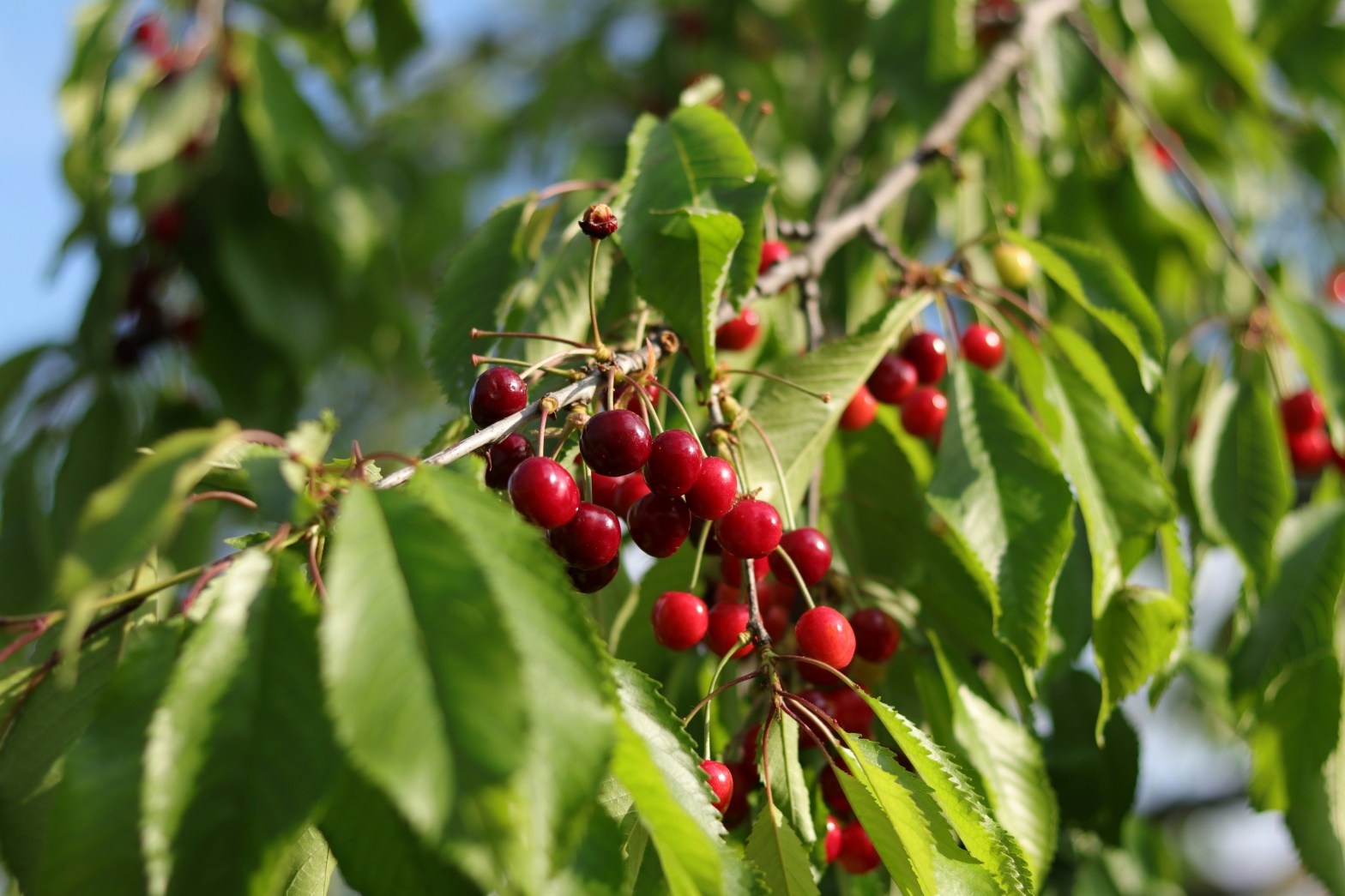
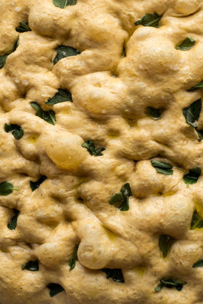
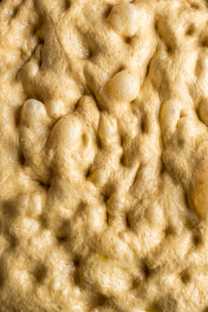
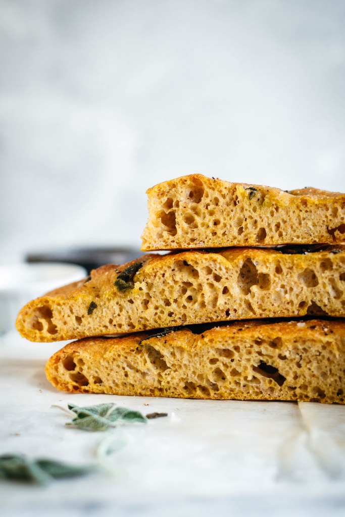
The foundation of engaging visual content is high-quality photography that makes your food look irresistible.
- Lighting: lighting can make or break a food photo. It affects texture, colour, and how fresh or appealing your product looks. If the lighting is too harsh or too flat, even the best styling won’t help. For most food brands creating content in-house, natural light is the easiest place to start. A bright window and some diffusion (like a sheer curtain or a diffuser panel) can help you get soft, even light that brings out the best in your food. Artificial lighting can absolutely be effective too — but it takes the right tools, the right setup, and a bit of experience to get results that don’t look cold or unnatural. If you’re a busy founder or marketing manager, natural light might be the quicker, more practical route. It’s often more forgiving and easier to work with when you don’t have time for complex equipment or technical adjustments.
- Angles: experiment with different angles to find the most flattering perspective for each dish. Overhead shots work well for flat lays, while a 45-degree angle can showcase the depth and layers of a burger or sandwich.
- Styling: keep the presentation clean and focused. Use props sparingly to complement the dish without distracting from it. Fresh ingredients, simple utensils, and neutral backgrounds can enhance the overall appeal.
- Editing: post-processing should enhance the natural colours and textures of the food. Adjust brightness, contrast, and saturation to make the image pop, but avoid over-editing that can make the food look unnatural.
Example: a well-lit photo of a fresh salad or sandwich with vibrant and colourful ingredients, styled on a neutral background with minimal props, can convey freshness and health, appealing to health-conscious consumers.


2. Incorporate your brand’s colour palette
Consistent use of your brand’s colour palette in visual content helps reinforce brand identity and makes your content instantly recognisable.
- Backgrounds and props: choose backgrounds, tableware, and props that reflect your brand colours. This consistency creates a cohesive look across all your content.
- Food presentation: incorporate brand colours into the food itself when possible. For example, a bakery with a pastel-themed brand might use pastel-colored frosting or decorations.
- Graphic elements: Use brand colours in text overlays, logos, and other graphic elements to maintain consistency across different types of content.
Example: a coffee shop with a rustic brand identity might use wooden tables, earthy-toned mugs, and natural lighting to create a warm, inviting atmosphere in their photos.

3. Tell a story through your visuals
Storytelling adds depth to your content, making it more engaging and memorable. Visual storytelling can convey your brand values, the origin of your ingredients, or the experience of enjoying your product.
- Behind-the-scenes: Share images of the cooking process, ingredient sourcing, or your team at work. This transparency builds trust and connection with your audience.
- Customer experience: Showcase customers enjoying your food in real settings. This not only provides social proof but also helps potential customers envision themselves in those scenarios.
- Seasonal themes: Align your content with seasons, holidays, or events to make it timely and relevant.
Example: a farm-to-table restaurant might share images of their chef selecting fresh produce at a local market, preparing the dish, and serving it to customers, illustrating the journey from farm to plate.

4. Utilise video content to showcase movement and texture
Videos can capture the dynamic aspects of food that photos cannot, such as the sizzle of a steak or the pour of a sauce.
- Short clips: create short, engaging videos that highlight the preparation process, the final presentation, or customer reactions.
- Reels and stories: use platforms like Instagram Reels or Stories to share quick, behind-the-scenes glimpses or tips related to your food offerings.
- Tutorials: share step-by-step cooking tutorials or recipe ideas that incorporate your products, providing value to your audience.
Example: a bakery could post a time-lapse video of a cake being decorated, showcasing the skill and care involved in their creations.
5. Engage with user-generated content
Encouraging your customers to share their own photos and experiences with your brand can build community and provide authentic content.
- Hashtags: create a branded hashtag and encourage customers to use it when posting about your products.
- Contests: run photo contests where customers submit their best shots for a chance to win a prize. This not only generates content but also increases engagement.
- Feature customers: Share user-generated content on your own channels, giving credit to the original creators. This recognition can foster loyalty and encourage more sharing.
Example: a smoothie brand might encourage customers to share photos of their smoothie creations using a specific hashtag, then feature selected posts on their Instagram feed.
Conclusion
Creating engaging visual content for your food brand involves more than just taking attractive photos. It requires a strategic approach that incorporates high-quality imagery, consistent branding, storytelling, dynamic video content, and community engagement.
By implementing these five strategies, you can enhance your brand’s visual presence, connect more deeply with your audience, and drive growth in a competitive market.
Remember, the key is to be authentic, consistent, and attentive to what resonates with your audience. With thoughtful planning and execution, your visual content can become a powerful tool in building and sustaining your food brand’s success.
Want content that actually gets people to stop scrolling and remember your brand? I help food, drink and wellness brands create visuals that are clear, on-brand, and made to connect.
If you’re ready for content that works harder for your business, get in touch or check out my services. I’m a food photographer and videographer based in Dublin, Ireland (but working remotely with businesses globally).