How to choose a food photographer for your brand

Most brands choose a food photographer the wrong way around. They open Instagram or Google, find someone whose work looks beautiful, check the price, and make the call. The portfolio looks good, the costs check out, and the shoot goes ahead.

And then the content arrives and sits in a forgotten folder for the foreseeable future (or a couple of photos get used immediately, but nobody knows what to do with the rest). The images are beautiful, technically right and match the brief, but they don’t quite feel like what the brand needs. The food looks good, but doesn’t seem to be saying anything. There’s no clear thread between one image and the next. The portfolio that convinced them to hire this person was full of interesting work (or maybe someone recommended this photographer to you), but what you needed was proof that they were able to bring the right expertise and experience to the project, be the creative director or suggest hiring one, and be able to create images with a specific audience and marketing goals in mind.

This is the most common mistake in the hiring process, and it happens almost entirely because people know how to evaluate whether they like an image, but not whether an image is doing its job. Those are very different skills, and the second one is what you actually need when you’re choosing a photographer for your brand.


Know what you need before you look at a single portfolio

Before you start looking at anyone’s work, it’s helpful to be clear on a few foundational points, as clarity makes the conversation more useful from the start. I always mention that you don’t need a full brief before reaching out to a photographer, as this is often a grey area nobody talks about: on one side, there are founders, agencies and marketing teams scrambling to gather all the details and make a document as comprehensive as possible so they can control every little thing. On the other side, there are inexperienced photographers or people with a limited process, who actually prefer to just be told what to do. After nearly a decade working with clients of all sizes (from well-known names like Cadbury to businesses just starting out), I have enough experience under my sleeve to be able to have a clear opinion on this matter: while it’s completely fine and common to have a photographer who isn’t also taking care of the creative direction part (I do it), hiring someone who just follows a brief blindly will 99% of the time result in images that will end up being forgotten after the first use. And it’s the same for clients who try to micromanage the project and the person they hired for the job. For great results, there needs to be a certain degree of trust and willingness to collaborate on both sides — this is non-negotiable. The right hire will help you finalise the details with the skills and point of view that only a person who does this job every week can provide. In this context, I feel incredibly lucky (even if lucky is not the right word… I worked hard for this) to be able to provide clients with a point of view that covers creative direction, photography, videography, styling and marketing.

But let’s get back to the main topic: the most important thing to know is how the images will actually be used. Packaging requires a completely different approach from social media. Website hero images need a different composition from a launch campaign content. Paid advertising has its own requirements. This single piece of information shapes how a shoot needs to be planned, what the photographer needs to prepare, and what the images need to do — so arriving at a first conversation with a clear answer to “where is this content going?” is way more valuable than arriving with a mood board.

Beyond that: do you need photography only, or photography and video? How many images are you thinking of? And do you have a rough sense of budget? None of these answers need to be fixed figures. They just give the photographer enough to have a proper conversation with you.

An experienced photographer will build the rest of the brief with you through the right questions, a structured planning process, and the kind of knowledge that turns a rough direction into a clear shoot plan. The mood board, for instance, is something I always create myself once we’ve worked through the brief together — it’s part of my process, not the client’s homework. But I know some photographers expect clients to bring a fully formed visual direction. Knowing which kind you’re dealing with before you book is itself a useful thing to establish early.

The full detail of what a food photography brief should cover (and what most brands consistently leave out) is in this post.

What to actually look for in a portfolio

The most honest answer is that you’re looking for a gut feeling — and it’s a good idea to trust it more than a checklist. When you look at a portfolio and think “this person could work with my brand”, what you’re usually responding to is a combination of two things, even if you can’t immediately name them.

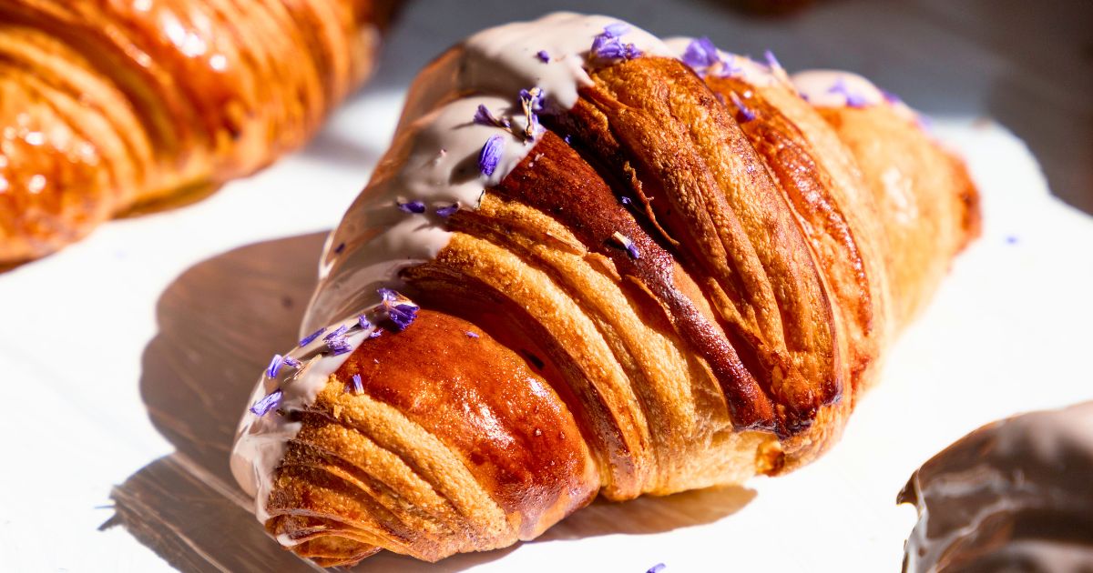
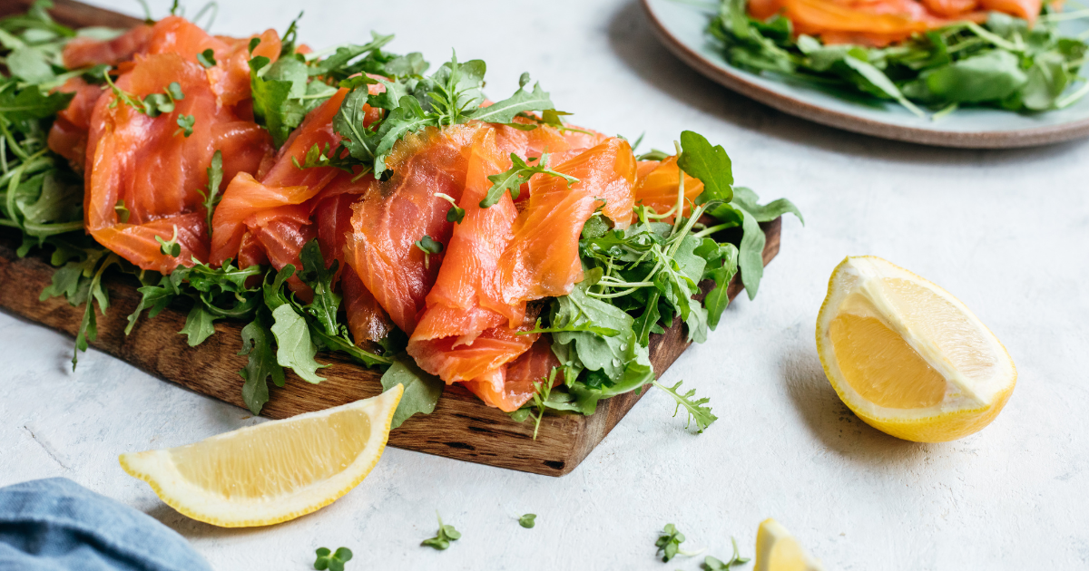
The first is flexibility. Not in the sense of having covered every possible style, format, or food category, but rather that the work doesn’t feel locked into one mode. A photographer whose portfolio feels like it could only ever look one specific way, regardless of the subject, is a photographer who will likely bring their aesthetic to your brief rather than bring your brief to life. What you want to see (even in personal projects, editorial work, or images that have nothing to do with your product) is evidence that the work is in service of the subject, meaning it was made for a reason specific to that image, not just made to look like everything else in the portfolio. I know it’s a concept that’s difficult to grasp, but after all these years working in the industry, I know it’s an essential one.

Every photographer has their own visual language, and that’s part of what you’re choosing when you hire someone. The goal is to find someone whose style has enough range that it can flex in the direction your brand needs: a photographer who works almost exclusively in one very specific visual register (very polished/edited with bold colours, or very dark and editorial, or very lifestyle and natural) isn’t necessarily wrong for your project, but it’s a question to think about. Can their work move toward what you need, or would the brief require them to work against everything their portfolio shows? The answer to that question is more useful than asking whether their best work looks beautiful — which it probably does, regardless.

The second is intentionality. Every image should feel considered — the light, the composition, the styling, the mood. Not perfect, not technically flawless, but deliberately made. There’s a difference between a photograph that was set up with purpose and one that was taken because the food was there and looked good. That difference shows, and it matters for commercial work because intentionality on a personal project usually translates directly to intentionality on a client brief.

What the portfolio doesn’t need to contain is a specific mix of work types. Personal projects, editorial food photography, and commercial brand work can all demonstrate the same underlying skills. You should approach the portfolio with this question in mind: does the work show someone who thinks carefully about what an image needs to do before they pick up the camera?

Range is another important factor to take into account: a photographer who has worked across different types of food, aesthetics, and formats will generally adapt more readily to a new brief than one whose portfolio is all variations of the same thing. But range is a supporting piece, more than a specific requirement on its own.

The photographer and stylist question

One of the most practically important things to establish before hiring is whether the photographer you’re talking to also handles food styling, or whether styling is something you’d need to source separately.

Food photography and food styling are two distinct areas. The photographer handles the technical and creative aspects of capturing the image. The stylist prepares and arranges the food — choosing ingredients, plating, managing the appearance of everything in the frame throughout the shoot, handling the challenges that come with food on set (things wilting, separating, losing their surface, behaving differently than expected under certain conditions). A full breakdown of what each involves is in this post.

Some photographers also do styling. Some don’t and bring in a dedicated stylist. Some work exclusively as photographers and expect the client to handle the food preparation and presentation. These are three completely different setups, and they produce different results and require different planning from the brand.

If styling is included in the photographer’s scope, ask what that actually involves — whether they source their own props, cook and prepare the food, and have their own prop/backdrop collection or whether you’d need to supply everything. If styling is a separate hire, factor that into the budget and planning timeline from the start.

I do both photography and styling, which is not a universal thing. My prop and backdrop collection has grown significantly over the years (with plates, glasses, bowls, cutlery, cups, linens and over forty backgrounds and backdrop options), which means shoots can be planned and executed without the brand needing to source anything beyond their products and without the additional cost of renting or purchasing props (which also saves a lot of time). If we need to find new props for a specific project, that’s usually something I cover as well. That kind of setup changes the planning process and what a client needs to prepare.

Questions to ask and what good answers sound like

The questions a photographer asks you are often as revealing as the answers they give to your questions. A photographer with a serious, tried and tested process will ask about your brand, where the images will be used, what you need them to communicate, and what your timeline looks like — before they’ve even sent you a quote. And also send you more questions the minute you sign the contract. That’s not being nosy, trust me. This is simply what it looks like when someone is thinking about your project properly rather than just trying to fill a slot in their calendar. It honestly took me a while to have this kind of process in place with my clients, but it’s a game-changer — for both sides.

The questions you should ask in return:

How do you approach the planning stage? A photographer with a clear process will tell you exactly what happens between enquiry and shoot — brief, mood board, shot list, what they need from you and when, what they’ll prepare. Someone who doesn’t have a clear answer to this question probably doesn’t have a structured process, which tends to show up on the day or in the final images.

What’s included in your fee? This seems obvious but comes up repeatedly as a source of confusion. Does the fee include styling? Props? Props sourcing? Studio equipment? Studio hire? Post-production? How many final edited images? What turnaround time? Usage and licensing? Two quotes at similar price points can be covering very different scopes.

Who creates the mood board? In my process, I create the mood board — it’s part of my preparation, not something I hand off to the client to put together (though it’s true that clients sometimes arrive with a few ideas on their own, and that’s perfectly fine). Not every photographer works this way, and some expect clients to bring a fully formed visual direction (or hire a creative director for the shoot). Knowing this upfront changes what you need to prepare.

How do you handle usage rights and licensing? If you’re planning to use the images in paid advertising, on packaging, or across multiple channels over a long period, this needs to be established from the start. Usage rights significantly affect cost, and discovering this after the shoot is an expensive and avoidable surprise. A detailed post on this is in ” How much does food photography cost“, which covers what drives pricing and why usage is one of the most consistently misunderstood parts of the process. You should talk with the photographer about usage rights, licensing, timeframe (and renewal options), paid advertising, and copyright.

Can you walk me through how you’d approach a project like mine? This is more useful than asking for perfectly matching examples of previous work. A photographer who can speak specifically about how they’d think through your brief (mentioning things like setup, creative direction, styling direction, or challenges specific to your product type) is giving you far more useful information than a portfolio that happens to contain something similar. If they can’t engage with your brief at this stage, that tells you something, too.

Red flags to take seriously

The absence of a planning process is the biggest one. A photographer who takes a brief (or doesn’t even need one) and moves straight to the shoot without a structured preparation stage (no detailed brief, mood board, shot list, or conversation about the details) is creating the conditions for a shoot that produces technically good images that won’t be useful for the brand.

A price that seems significantly lower than everyone else without a clear explanation is another — I know an incredibly low rate makes you fall for the “shiny object syndrome” faster than you can even say the cost out loud, but this is a business investment and needs to be thought through thoroughly. Food photography involves time, preparation, equipment, and expertise, and a quote that doesn’t account for those things is often a sign that they’re not being provided. Occasionally, someone is simply building their portfolio and pricing accordingly — in which case they’ll usually say so. If they don’t, ask what’s included and why the price is structured the way it is.

No contract, no usage rights or vague licensing terms are a serious one, particularly if you’re planning to use the images commercially. A professional photographer will have a clear contract that specifies deliverables, timeline, usage rights, and what happens if either party needs to change the terms. Vague arrangements tend to produce vague outcomes.

Reluctance to share examples of brand work or to discuss the planning process in any detail before a booking is confirmed is also a red flag. Most professional photographers are happy to talk through how they work and what the process looks like — it’s all part of how they build trust with a new client.

Understanding pricing

Food photography pricing varies significantly based on experience, what’s included, scope, and intended usage. The range is wide enough that a single number is almost meaningless without context.

Rather than trying to quote a market rate here, the “How much does food photography cost” post covers this in detail — what drives the price up or down, why usage rights matter so much, what cheap photography tends to cost you in the long run, and what to factor into your budget before you start approaching people.

The short version: know your end use before you discuss pricing, ask explicitly what’s included in any quote, and be wary of comparing quotes without understanding what each one actually covers.

Local, remote, or somewhere in between

The assumption that a food photographer needs to be based in the same city (or even the same country) as their client deserves to be talked about because it rules out a lot of good working relationships for the wrong reasons.

For photography that involves a specific product, the practical question is simply: can the product get to the photographer? For most packaged food and drink, shipping is straightforward. I’ve worked with brands whose products were distributed internationally, with the product shipped directly to my studio and the entire project (recipe development, photography, and delivery of final images) handled remotely without the client ever setting foot on set. In one case, the client was a well-known international brand and the agency managing the project was based in the US. Everything was coordinated remotely and the process was smooth because the planning was thorough.

There are genuine limitations, though. Perishable products that can’t be shipped, shoots that require a specific location, or situations where international shipping costs or logistics make the whole thing impractical — those are situations in which working with someone local makes more sense. But those cases are fewer than most brands assume when they automatically search for a photographer in their own city.

For recipe content that doesn’t feature a specific product (think food content for nutritionists, wellness professionals, food bloggers, or brands that occasionally want recipe content without a product focus), location is essentially irrelevant. I can develop and photograph recipes using ingredients available locally, deliver the content, and the client never needs to send anything. This works for once-off projects and for ongoing monthly retainers equally well.

The client doesn’t need to be present during the shoot either. I work without real-time client approval on set: this doesn’t mean the client isn’t involved; it’s simply a sign that the planning process that happens beforehand covers everything that would otherwise need to be decided in the moment. By the time the shoot day arrives, the brief is complete, the mood board is approved, the shot list is confirmed, and there are no open questions left to answer. That’s what makes remote work function properly.

For shoots that benefit from proximity (location work, on-site photography, or projects where the product needs to be included but can’t be shipped), I work primarily in Dublin and occasionally across Ireland.


Read this before you start looking

The photographer you choose will shape how your brand looks for as long as you use that content, and potentially for much longer if the work gets repurposed, featured, or becomes part of your established visual identity.

If you only had to leave with one main takeaway from reading this blog post, let it be this one: you are not just looking for someone who takes pretty food photographs. You are planning an investment for your business and you are looking for someone who understands what you’re trying to do with those photographs and someone with the process, experience, and creative range to make that happen reliably.

If you want to understand more about what the process looks like in practice, the “How to brief a food photographer” post covers the planning stage in detail. And if you’re at the point where you are starting to think about a photoshoot, get in touch with me here — the first step is always a chat about what you need.

How much does a food photographer cost?
Food photography pricing varies significantly depending on experience, what’s included in the fee, the scope of the project, and how the images will be used. Usage rights in particular can affect cost considerably — images licensed for paid advertising or packaging are priced differently from images for organic social media use. A detailed breakdown of what drives food photography pricing is in this post.

Do I need to hire a food stylist separately from a food photographer?
Not always — it depends on the photographer and the project. Some food photographers also handle food styling as part of their service, which means they prepare and arrange the food, manage its appearance throughout the shoot, and bring their own props and surfaces. Others work purely as photographers and either expect the brand to handle the styling or work with a separate stylist whose fee comes on top. It’s one of the most important practical questions to clarify before booking, because the answer changes the cost, the logistics, and what you need to prepare. This post covers the difference between the two roles in detail.

What questions should I ask a food photographer before booking?
The most important ones: how do you approach the planning stage and what does your process look like before the shoot? What’s included in your fee — styling, props, post-production, how many final images? Who creates the mood board? How do you handle usage rights and licensing? Can you show examples of similar commercial work? How a photographer answers these questions tells you as much about whether they’re the right fit as anything in their portfolio.

How do I know if a food photographer is right for my brand?
Look for three things beyond the portfolio: a structured planning process that starts with questions about your brand and audience rather than jumping straight to the shoot, commercial experience with food brands rather than only personal projects, and transparency about what’s included in the fee, how usage rights work, and what happens if something changes. A photographer who asks the right questions before you’ve even booked is usually a stronger signal than one whose portfolio looks impressive but has a vague process.

How do I know if a food photographer is right for my brand?
For photography that involves a specific product, the practical question is whether the product can be shipped to the photographer. For most packaged food and drink, this is straightforward — I’ve worked with international brands and US-based agencies entirely remotely, with products shipped directly to my studio and the full project handled without the client ever needing to be on set. Perishable products, location-specific shoots, or situations where shipping isn’t practical are the exceptions. For recipe content that doesn’t feature a specific product, location is entirely irrelevant — I can develop and photograph recipes using locally available ingredients and deliver the content wherever the client is based. Social media strategy, consultations, and copywriting work the same way.

How storytelling in social media marketing sold out a Christmas campaign for a food brand

By the time the Wall Street Journal and Forbes both wrote about storytelling becoming the most in-demand skill in marketing (in December 2025, within days of each other), I’d already watched it play out across more than one campaign, with the numbers to back it up.

Posts and Stories that felt like they were talking to one specific person were outperforming posts that were talking at a general audience. Don’t get me wrong, this has always been a winning strategy on social media and in marketing; it’s the famous “if you try talking to everyone, you’ll end up talking to nobody” that you have probably heard multiple times. What was different here was the scale of the gap. The human-to-human connection combined with storytelling was way more effective, and the straight product content was working less well than usual (even when done properly).

I have a theory about why, and it’s not complicated: AI-generated content done badly is everywhere now, and it’s all generic and forgettable, and audiences have developed a finely tuned instinct for what’s been produced by a machine trying to sound human versus something written by a person who actually thought about what they were saying. Content fatigue is real, and the craving for human connection in a feed full of polished sameness is very much there. Whatever the exact cause, the fact is that, in the past few years, storytelling and people-centred content have been working better than they had in a while.

This post is about what storytelling in social media marketing actually means in practice (not the buzzword version) and about a specific campaign where it made a measurable difference.

What storytelling in social media marketing actually means

The word gets used so loosely in marketing that it’s important to be specific about what it actually involves, because storytelling doesn’t equal “tell your brand’s story” or “write with personality”.

The reality is that while your story should absolutely be part of your marketing, your customer isn’t specifically interested in hearing an essay about that. They’re interested in their own story, and specifically in whether you understand it well enough to reflect it back to them. They are interested in how your story helped you make a difference for them. The brands that get storytelling right are the ones that have studied their audience closely enough to know what their life actually looks like (what they’re stressed about, what they’re proud of, what they’re trying to do or feel or avoid) and create content that makes people think “oh wait, that’s me”.

You don’t sell olive oil. You sell a spoonful of antioxidants in every meal. You don’t sell a massage. You sell fifty minutes without anyone asking you anything. You don’t sell a flight to Lisbon. You sell pastéis de nata for breakfast, lunch, and dinner (every time I bring up this example, I want to book a flight to Lisbon!). The difference between those two ways of describing the same thing is the difference between telling someone what you sell and making them feel something. People have always bought feelings. And the product or service is just how the feeling gets delivered.

What makes this harder than it sounds is that it requires resisting the instinct to lead with the product or service and solely leaning into what I call the “sell, sell, sell” strategy (I get it, it’s difficult — you are trying to promote a business, and the ultimate goal is, of course, selling). Most brands, understandably, want to talk about what they make, how it’s made, why it’s good, and what makes them different. And repeat that as often as possible. None of that is wrong — it just isn’t enough on its own, because every other brand in the same space is saying almost the same things in almost the same words, and audiences have learned to scroll past it without really remembering any of it.

The other thing that makes it challenging is that it requires knowing your audience well enough to actually show them a version of their own life. That knowledge doesn’t come from a spreadsheet or a demographic breakdown. You really need to invest time and attention in getting to know that specific audience and ask the right questions. When a client works with me for the first time, that process starts on day one through onboarding, audience research, and building a clear picture of who you’re talking to and why. Over time, and across multiple seasons and campaigns, that understanding deepens, and every campaign is more informed and stronger than the last.


The campaign

The client was a small Irish food brand with an online shop. Every Q4, they launch a special Christmas product: it’s a seasonal offering that needs to be able to stand out at a time of year when every other food brand is suddenly more present than usual, everyone is running paid promotions, and audiences are simultaneously more receptive to buying and more overwhelmed by choice.

I had been managing their social media (strategy, content creation, copywriting, and day-to-day management) for a few years at this point, which meant I had been through the festive season with them and their audience before. I knew what had worked, what hadn’t, what the audience responded to, and what they scrolled past. And that accumulated knowledge (combined with current trends, user behaviour, and best practices on social media) mattered more than any single tactical decision.

The previous year’s Christmas campaign went well, and the goal for this one was to build on that using the same organic-only approach (no paid advertising), but with a sharper strategy.

The feed content stayed consistent with the brand’s established visual style. I created everything (photography, video, graphics, captions) and the client reviewed and approved it before anything went live, which is the standard workflow for feed content I use with my social media clients. That approval process exists to protect the brand and make sure everything is aligned before it’s published.

Stories were different. With a client I’d been working with long enough to have built real trust, Stories went out without an approval step. This reflects the kind of working relationship that develops over time, when a client trusts your understanding of their brand and their audience (but it’s also true that this is the approach most of my clients choose from day one). It also meant I could move quickly and take a creative risk without a sign-off cycle slowing things down, which turned out to matter.

The real change in this campaign happened on Stories. In previous campaigns, Stories had been used in a fairly conventional way (more product-focused, promotional, and sales-driven), while still keeping the audience at the centre of the strategy. This time I took a different approach entirely. Instead of pushing the product, the Stories focused on the experience of Christmas itself: the stress of hosting, the pressure of planning, scenarios they’d want to immediately forward to someone else and the moments people actually recognise from their own lives. Written storytelling (plainly laid out with sentences like “is this you?” and “does this sound familiar?”, but also included naturally in the content) with simple design, minimal imagery, and copy that felt human rather than salesy.

The idea was to make people feel seen before making them feel sold to.

The results

This is a relatively small account with a few content constraints I had to work around. Not exactly your black canvas where you can test out all the top-performing strategies and content formats. During November and part of December, the campaign delivered results I’m particularly proud of.

52,000 impressions on Instagram: consistent visibility across a competitive period, holding steady with regular monthly performance despite the noise of Q4.

+20% increase in Story impressions: a direct reflection of the storytelling shift. More people were watching Stories through to the end and engaging with them, which means the content was connecting.

419 clicks on the custom Christmas link, a 66% increase compared to the previous year. And the majority of those clicks came directly from Stories. This is the clearest indicator that the approach worked: more people engaged, more clicked through, and more bought.

251 clicks on the link in bio: consistent interest in both the Christmas product and the brand’s regular range throughout the campaign period.

The Christmas box sold out.

Could some of that be down to timing, a good season, or factors outside the content? Possibly — and that honesty is part of how I work. But the 66% jump in link clicks compared to the same campaign the previous year (I had to check it twice when I first saw it), and the clear correlation between the Stories shift and the engagement uptick, make a strong case that the strategy made the difference. The feed content hadn’t changed significantly, but Stories had. And the results followed.

What this campaign demonstrates

The results matter, but the more useful lesson to learn from this campaign is the underlying principle: audiences respond to content that makes them feel understood, and they tend to move past content that just describes a product, however good that product is.

This concept is probably as old as marketing itself, but it’s often forgotten. Here is coming back in full force because what’s changed is the context: we’re in a moment where AI is producing enormous volumes of surface-level content that allows you to hit post as many times as you want but connects with nobody. Against that backdrop, content that sounds like a person talking to a specific other person (i.e. your target audience) stands out more than it did when the competition was other humans writing in the same generic register. The Wall Street Journal and Forbes (and many others) both identified storytelling as one of the most sought-after and hardest-to-find marketing skills in December 2025. The campaign data above is a small but concrete example of why.

I recently shared a social media post on my page with a good example of how this thinking works in practice: everyone assumes there’s nothing new to say about sourdough, and that might be true if you’re thinking about it the way most brands think about it — as a product to describe and promote. But a bakery, a café, a health food shop, a nutritionist, and a food blogger all have completely different audiences with very different reasons to care about the same loaf of bread. The product doesn’t change, but the story changes every time, for every brand, and for every audience. That’s the whole job of good storytelling.


Working with someone who thinks this way

Social media strategy, management, photo and short-form video creation for food, drink, and wellness brands is the work I do every day. If your brand deserves this level of attention (or if you’re heading into a launch or seasonal campaign and want to approach it differently) and you haven’t found the right creative partner yet, I’d love to hear about what you’re working on — get in touch here.

You can also read about the link in bio CTR results from a wellness client I’ve been managing for nearly two years (a different metric, same principle) in this post.

Extra virgin olive oil and polyphenols: a chemist’s guide to what’s actually in the bottle

A few months ago, I fell down a rabbit hole I (happily) haven’t entirely climbed out of yet. It started with a combination of personal reasons and professional curiosity colliding at the same time.

My partner has Type 1 diabetes, so I’ve always paid close attention to what we eat — not in a restrictive way, but with a consistent focus on anti-inflammatory foods and antioxidant density. That’s always been part of how I cook and how I think about food for us. Recently, it became more of a priority and deliberate focus than a background one, and extra virgin olive oil (specifically high-polyphenol extra virgin olive oil) ended up at the centre of it (considering that, as Italians, we are not exactly stingy when it comes to olive oil). We’d been mainly using an Italian EVOO we loved for years, and when it became harder to find in shops, the search for an alternative turned into a full investigation into what we were actually looking for and why. One thing led to another, and here we are.

I want to be clear about what this post is and what it isn’t. It’s not a health and nutrition post — there are plenty of those, many written by experienced practitioners who know far more about the clinical side of this than I do, and if health outcomes are what you’re after, those are the posts to look for. This is my usual angle: food science and cooking, with a touch of the marketing world layered on top, because it’s hard to talk about olive oil right now without talking about how it’s being sold. For anyone reading as a brand in the olive oil space (or a brand that uses olive oil as an ingredient and wants to communicate better about it), there’s a section for you at the end.


Before starting to chat about all the details and the science behind high-polyphenol EVOO, there’s one distinction that needs to be mentioned, as I know it often creates some confusion: “olive oil” and “extra virgin olive oil” are not the same product. Standard olive oil (often labelled “pure”, “classic” or simply “olive oil”) is refined, meaning lower-grade oil has been processed through industrial refining (including alkali treatment, bleaching, and steam deodorisation) to remove defects and neutralise the flavour. That process strips away most of the polyphenols, vitamins, and aromatic compounds. A small amount of virgin or extra virgin olive oil is typically blended back in at the end to add some colour and taste, but the polyphenol levels cannot be compared to a real unrefined EVOO. If polyphenol content is part of what you’re looking for, the label needs to say extra virgin (and maybe even something more, as you will learn shortly).

What polyphenols actually are

Polyphenols are a large and diverse class of naturally occurring compounds found in plants. What they have in common structurally is that they contain multiple phenol units (ring-shaped molecular structures with a hydroxyl group attached — this is my bread and butter, by the way) and it’s this structure that gives them their antioxidant activity. Plants produce polyphenols as part of their defence system against UV radiation, insects, fungi, and environmental stress, which is thought to be part of why olive trees grown in difficult, high-stress conditions (rocky soil, temperature extremes, low rainfall) tend to produce olives with higher polyphenol concentrations than those grown in more comfortable conditions.

In extra virgin olive oil, the polyphenols that get the most attention are oleuropein, hydroxytyrosol, oleocanthal, and oleacein. Oleuropein is the most abundant polyphenol in unripe olives and is responsible for much of the bitterness in early harvest oils. As olives ripen, oleuropein breaks down via enzymatic hydrolysis into hydroxytyrosol and other compounds — which is why late harvest oils and most supermarket EVOOs have a milder, less bitter flavour profile. Hydroxytyrosol is one of the most potent antioxidants found in any food. Oleocanthal is responsible for the peppery, throat-catching sensation you get at the back of the throat when tasting a high-polyphenol oil neat. It inhibits the same cyclooxygenase enzymes (COX-1 and COX-2) as ibuprofen (a finding published in Nature in 2005), but the throat sensation itself is actually a separate mechanism: both oleocanthal and ibuprofen in solution activate the TRPA1 receptor, which is spatially localised to the back of the throat. The COX inhibition and the throat irritation are two distinct but related discoveries, and together they’re what makes oleocanthal one of the more chemically interesting compounds in food. Oleacein rounds out the group as another phenolic compound with strong antioxidant activity.

The EU has an authorised health claim under Regulation 432/2012 specifically for hydroxytyrosol and its derivatives (including oleuropein complex and tyrosol) — not for total phenolic content as a broad measure. The claim states that consuming 20g of a qualifying oil daily contributes to protecting blood lipids from oxidative stress, and it may only be used on oils containing at least 5mg of those specific compounds per 20g of oil. That works out to 250 mg/kg, which is the threshold you’ll most often see cited in marketing, but the regulation is measuring a defined subset of phenols, not everything a total polyphenol test would capture. It’s a meaningful distinction if you’re comparing lab certificates, since different analytical methods can give quite different numbers for the same oil. That 250 mg/kg threshold is the regulatory line that separates “high polyphenol” as a meaningful, verifiable claim from marketing language — and many standard supermarket extra virgin olive oils fall below it despite being perfectly legitimate extra virgin olive oil by grade.

Extra virgin olive oil as a legal category requires free acidity below 0.8%, no sensory defects, and production by mechanical means only — many standard supermarket EVOOs meet those criteria perfectly and still fall below 250 mg/kg polyphenol content. Some premium certified oils reach 500, 600, 700, or above 1000 mg/kg (the strongest I tried so far has 976 mg/kg).

Why early harvest matters

The polyphenol content of an olive oil is shaped by how the olives are grown, when they’re harvested, and how the oil is extracted. Of these, harvest timing is the most significant variable for most producers.

Olives harvested early (while still green, before full maturation) contain significantly higher polyphenol concentrations than those harvested at full ripeness. As the fruit matures on the tree, polyphenol content naturally declines while oil yield increases. An early harvest olive produces less oil per kilogram of fruit than a ripe one: this is a real, meaningful commercial trade-off, and producers who choose to harvest early are making a clear decision to sacrifice volume for polyphenol density and flavour complexity. The price difference once the product reaches the shelves is a direct reflection of that decision.

The early harvest choice has a pretty distinct effect on the flavour profile. Early harvest oils are typically grassy and herbaceous on the nose, sometimes with an artichoke or fresh-cut grass quality. On the palate, bitterness and pungency (and that unique sensation in your throat) are more pronounced. This is the work of polyphenols, not a sign that something is off with the oil. A flat, smooth, very mild oil with no bitterness and no clear finish is easier for most people to use on everyday dishes, but for someone specifically looking for polyphenol content, that absence also tells something about what isn’t there chemically.

What does cold pressing mean

EU regulation defines two specific official terms for this. “First cold pressing” is reserved for the traditional method using hydraulic presses. “Cold extraction” is the official term for the modern centrifugal method, which is how the vast majority of commercial EVOO is produced today. Both require the entire process to stay below 27°C. “Cold pressed” is a third phrase that appears widely on consumer labels as informal shorthand, but it isn’t one of the EU’s two specifically defined and regulated designations, which makes it less verifiable than the official terms.

The 27°C limit is what actually matters, regardless of which term appears on the bottle. It’s the threshold that protects polyphenols and aromatic compounds from heat degradation during extraction. Industrial methods that prioritise yield use higher temperatures, which increases the oil recovered from the fruit but progressively degrades the phenolic compounds in the process. Cold extraction, properly controlled and documented, preserves them.

Cold extraction alone doesn’t tell you the polyphenol content, the harvest date, or the olive variety: this means it’s one necessary condition for quality, not a complete picture. The most transparent producers combine cold extraction with published laboratory analysis showing actual phenolic levels per kilogram, which is increasingly the standard among premium producers and the most reliable thing to look for if you’re trying to evaluate a specific oil (and I absolutely love this trend).

Single estate versus blended

A single estate oil (sometimes labelled single origin) means the olives came from one specific farm or grove, with traceable growing conditions, a documented harvest date, and a flavour profile that reflects a specific place and variety. A blended oil combines fruit from multiple sources, often across different countries, to produce consistent flavour at scale.

Blended doesn’t automatically mean lower quality, and blending is partly how producers achieve stability in flavour across different harvests. But single estate oils offer something blended ones structurally can’t: full traceability and the kind of specificity that makes it possible to understand what you’re tasting and verify what you’re buying (and this means a lot, considering how high-quality EVOO can make a significant dent in your monthly grocery budget). Knowing the olive variety, the region, the harvest date, and the polyphenol certificate of a specific oil is only possible when production is contained and documented; large-scale industrial blending makes it impossible. For anyone specifically interested in polyphenol content and verifiable quality, single estate is generally where you’ll find that information presented clearly.

Are bitterness and pungency signals of quality?

This deserves its own section because it’s one of the things that, for anyone new to high-polyphenol oils, needs a little introduction.

The bitterness and throat pungency that are characteristic of early harvest, high-polyphenol extra virgin olive oil are not flaws that need to be removed or masked. They are direct sensory signals of polyphenol presence. The bitterness is primarily oleuropein, while the throat catch is oleocanthal. When you taste a high-quality oil and it almost makes you cough a little or leaves a sustained pepper-like sensation at the back of the throat, that’s the oil showing you its composition more directly than any label claim can.

Most people are accustomed to mild, neutral olive oils because those are the ones that dominate supermarket shelves and have shaped what most people expect olive oil to taste like. A good, high-polyphenol oil tasted for the first time can be quite the experience — more intense, bitter, and powerful than expected. Once you understand what you’re tasting and why, it’s difficult to go back to the mild version and not notice what’s missing.


The cooking question and the answer you have been looking for

The idea that you shouldn’t cook with extra virgin olive oil is one of those pieces of advice that gets repeated so confidently and so often that questioning it feels counterintuitive. The chemistry doesn’t support it as a black-or-white rule, and the details are far more intriguing than either “never cook with it” or “always cook with it”.

The smoke point of extra virgin olive oil is approximately 175–210°C depending on the oil’s free acidity, variety, and quality — oils with lower acidity generally have higher smoke points. Most home cooking happens well within that range. And when researchers at the University of Porto tested different olive oil categories under sustained deep-frying conditions, all of them significantly outlasted a commercial vegetable oil blend before reaching the maximum legal polar compound threshold (the breakdown products that form in oil when it degrades under heat). This suggests the oil doesn’t break down structurally at normal cooking temperatures in the way the “never cook with it” advice implies.

Research published in the Journal of Agricultural and Food Chemistry found that the key compounds in high-polyphenol oils behave quite differently from each other under heat: hydroxytyrosol and its derivatives show the highest rate of degradation at frying temperatures, while tocopherols (vitamin E) degrade at a similar or somewhat lower rate. Tyrosol and its derivatives, along with lignans, showed considerably more stability, with lignans remaining largely intact even after extended heating. So “heat destroys polyphenols” is too blunt; the picture is compound-specific — and the compound most people associate with high-polyphenol EVOO is actually among the most heat-sensitive of the group.

The case for keeping a high-polyphenol oil out of the pan isn’t really that heat destroys everything catastrophically — it’s that you paid a significant premium for an oil specifically for its phenolic content, and raw or finishing use is simply the most direct way to get the full benefit of what you bought. Using a good quality but less expensive EVOO for cooking and keeping the high-polyphenol bottle for finishing, salads, and drizzling is a practical choice rather than a safety rule.

My own approach is exactly that — a different EVOO in the pan, the high-polyphenol bottle for everything raw and for finishing. I’m well aware that cooking with it wouldn’t be wrong, but this is the choice that makes more sense for what I’m trying to get from each oil.


What’s happening in the olive oil market right now

Something has shifted noticeably in how premium olive oil producers communicate their products, and it reflects a real change in what a segment of consumers is asking for (and I absolutely love seeing these patterns).

A few years ago, premium olive oil marketing was built primarily around provenance, tradition, and flavour. The leading brands now lead with data: published polyphenol certificates, lab-verified phenolic content per batch, QR codes linking directly to analysis reports, harvest date transparency, side-by-side comparisons of oleocanthal and oleacein levels across different harvests. The technical detail that used to be found in academic papers and specialist competitions has moved to social media, product pages, and bottle labels — because there is clearly a consumer audience that wants that kind of information.

From a brand perspective, this is interesting because it represents a different kind of trust-building than aesthetics or heritage can offer. A brand that can say “our 2025 harvest tested at 640 mg/kg, here is the certificate” is having a different conversation with its customers than one relying on beautiful packaging, Mediterranean imagery and a “made in the traditional way” claim. Both can coexist in the market, but thanks to the transparency-led approach, now certain brands can build a very specific kind of trust and loyalty, which is something any business in the food space can learn from, regardless of what they make.

The other shift I love seeing on social media: bringing a bottle of high-quality extra virgin olive oil to a dinner party instead of wine. It sounds niche, I know. But it’s becoming increasingly more popular, and it makes complete sense when you think about it: a well-chosen bottle (maybe even single estate and early harvest) is a more considered and interesting gift than another unremarkable wine, and it opens a conversation about food and cooking that most dinner guests are happy to have. I’m entirely behind this new trend.


Before you go looking for your new favourite EVOO

If this has made you curious about exploring high-polyphenol extra virgin olive oils, a few practical things: polyphenols degrade with light and oxygen, so dark glass bottles or tins are preferable to clear glass. Harvest date matters more than best before date — an oil from the current or most recent harvest, properly stored away from direct light and heat, will be in better condition than an older oil regardless of what the label says. And trust the flavour: the bitterness and throat catch that used to be dismissed as poor quality are the most direct sensory confirmation available that the polyphenols you’re looking for are actually present.

For more on the food science behind the compounds and reactions that shape flavour and cooking behaviour, the food and food science section of this blog covers the Maillard reaction, emulsification, acidity, and what happens at a molecular level when food is cooked.

What does “high polyphenol” mean on an olive oil label, and why doesn’t the nutrition label show it?

“High polyphenol” refers to oils containing at least 250 mg/kg of specific phenolic compounds — the threshold required under the EU regulation to carry an authorised health claim. This is the EU framework, and since most premium high-polyphenol oils come from EU-producing countries, it’s the most relevant reference point for most buyers. A published lab certificate is always more useful than any wording on the label. Producers who have good numbers almost always publish them, and you can usually find them on their website (or they might be available on request). On the nutrition label, you’ll often find only the amount of tocopherols (vitamin E), not polyphenols (and the two are different compounds).

Are tocopherols the same as polyphenols?

No, they’re both antioxidants found in extra virgin olive oil, but they’re chemically distinct compounds with different structures and different behaviour. Tocopherols are fat-soluble vitamins (vitamin E) and appear on the standard nutrition label as essential nutrients. Polyphenols (including hydroxytyrosol, oleocanthal, and oleuropein) are a separate class of compounds: they contain multiple phenolic ring structures and are found across a wide range of plant foods like olive oil, tea, vegetables, berries, and more.

What is the difference between cold-pressed and cold-extracted olive oil?

EU regulation defines two official terms: “first cold pressing” for the traditional hydraulic press method and “cold extraction” for the modern centrifugal method used by most producers today. Both require temperatures below 27°C. “Cold pressed” appears widely on labels as informal language, but isn’t one of the EU’s two specifically regulated designations. Cold extraction with a published polyphenol certificate is the most meaningful combination to look for.

What is the difference between extra virgin olive oil and olive oil?

Extra virgin olive oil is produced by mechanical means only, without industrial refining, and must meet strict standards for acidity and sensory quality. Standard olive oil is made from lower-grade oil that has been refined (through alkali treatment, bleaching, and steam deodorisation), which strips away most of the polyphenols, vitamins, and aromatic compounds. A small amount of virgin olive oil is blended back in at the end for colour and flavour. If polyphenol content matters to you, the label needs to say extra virgin.

How should I store extra virgin olive oil to preserve the polyphenols?

Polyphenols degrade with light, oxygen, and heat. Dark glass bottles or tins are preferable to clear glass. Store the oil in a cool, dark place — away from the hob (I see you wanting to keep that bottle on hand right next to the hob) and direct sunlight. Once opened, keep the bottle well sealed.

Does the country of origin determine the quality of an olive oil?

Not reliably. Excellent high-polyphenol oils are produced in Greece, Italy, Spain, Portugal, Croatia, and beyond — and mediocre oil can come from all of those places, too. What matters more than geography is producer transparency: a single traceable estate, a published harvest date, a lab certificate showing actual polyphenol levels, and documented extraction methods.

The Instagram metric that actually predicts enquiries — and what nearly two years of real data looks like

There’s a number most service-based brands are not looking at, and it’s the one that would tell them almost everything they need to know about whether their Instagram is actually doing its job.

Instead, most brands are watching their follower count, checking how many likes their latest post had, or comparing their numbers to accounts with ten times their following (sometimes even influencers’ pages), and concluding that something must be wrong with their content, posting frequency, or luck. What they’re rarely doing is asking the question that actually matters for a service-based business: of the people who find this account, how many are interested enough to take the next step?

That question has a metric: it’s called bio link CTR (the percentage of people who visit your profile and go on to click the link in your bio) and for a business where the goal of Instagram is to move someone from “oh, that’s nice” to “I want to book,” it’s significantly more useful than any reach or follower figure you’ll find in your insights.

This post is built around nearly two years of real data from a wellness client I manage social media for. The numbers are unusual in the best possible way — it’s a relatively small account, but the content strategy is clearly doing what it was built for. I’m sharing them here because I think they illustrate something important about what social media can look like when it’s measured by the right things.


Why follower count is the wrong number for service-based businesses

The obsession with follower count on Instagram is understandable. It’s the most visible metric, the one that shows up on your profile for anyone to see, and it carries a social proof logic that feels intuitive: more followers means more people trust you, which means more clients.

In practice, for a service-based business, this is backwards. A large following can increase your reach (the number of people who might see a given piece of content), but more reach does not automatically mean more bookings, and in many cases a larger following actively dilutes the ratio of people who are interested in what you do versus people who followed you for an unrelated reason, engaged with a viral post, or haven’t interacted with your content in years.

What converts to bookings is intent: someone found your account, looked at what you do, decided they wanted to know more, and clicked through to your website. That’s what we usually call a warm lead. This means the content has done its job. And that is exactly what bio link CTR measures.

The industry average for organic bio link CTR (the percentage of profile visitors who click the link in bio) is around 2–5%, based on data from social media analytics platform Flick, which tracks performance across more than 50,000 Instagram accounts. Anything above that means your profile is converting visitors to website traffic at above-average rates. Significantly above that means the content is doing something most accounts aren’t.


What nearly two years of data actually looks like

The client in question is a wellness practitioner offering one-to-one services — an established business with a loyal client base that needed a complete social media strategy built from scratch, managed consistently, and measured against the metrics that mattered for their business model. The account is small by most definitions: well under the threshold most people associate with a “strong” brand presence on Instagram (under 5k followers). All results below are from organic content only, no paid advertising.

The single number that frames everything else: this account has never dropped below 25% CTR in any single month across nearly two years of data. Most months, it’s between 30–50%. For several months, it has been well above that. Held against an industry average of 2–5%, these numbers are in a different league.

A few moments from across the collaboration deserve their own mention:

Over 1,000 link in bio clicks in the first six months alone — including Q4, when organic reach is notoriously harder across the board. A CTR of 57% in one month, meaning more than half of everyone who visited the profile that month clicked through to the website. A CTR of approximately 103% in another (I’ll explain what it actually means in the next section). A recovery month of nearly 60% CTR after a natural seasonal dip, with website clicks more than doubling from the month before.

New bookings came in consistently throughout, with multiple new clients mentioning they found the business through Instagram.

What the monthly data shows across the full period (without going into it line by line) is that even when reach fluctuates, the CTR holds steady. The baseline is 25%. The ceiling has been well above 100%. And it has stayed in that range through algorithm changes, seasonal dips, slow months, challenging Q4 weeks, and everything else.

What these numbers mean — and what they don’t

There are a few things that need to be addressed before we start drawing conclusions.

During year two, there was a month (September) with a surprisingly high figure (approximately 103% CTR), which is, of course, something that needs to be mentioned. It’s real data from Instagram Insights, and while the exact reason the metric can exceed 100% isn’t fully documented by Instagram publicly, it’s not uncommon for link click counts and profile visit counts to diverge a little. The most important takeaway here is that this was a month of unusually high engagement with the bio link relative to profile traffic, which, in the context of this account’s overall performance, is consistent with everything else the data shows.

The month following that 103% CTR (October) showed a lower number, which is also an important part of the full picture — and not something to be alarmed by. Seasonal fluctuations are real and predictable for service businesses. What matters is the recovery: The next month came back strongly at 59.5% CTR, with link clicks up over 114% from October. The strategy helped the page work through a seasonal dip and return to the usual strong results the following month, which is exactly what a well-built strategy is supposed to do.

The other thing these numbers don’t show is follower growth, viral content, or impressive reach figures. The profile visit numbers throughout are modest because this is not a large account. What the data shows, consistently across nearly two years, is that the people who do find the account are converting to website traffic at a rate that is between six and twelve times the industry average — every single month, including the slow ones.

That’s not a lucky month or the effect of a viral post here and there: that’s a strategy working.

Why this kind of result is unusual

Most social media management is not built around this kind of outcome, because most social media management is not measured this way.

The default approach (post consistently, use trending audio, chase engagement, grow the following) is designed to produce visible metrics. It produces likes, reach, and follower counts. It can do all of those things without producing a single enquiry, and on a service-based account where the audience is small and the content isn’t designed to move people through to the next step, that’s exactly what happens. Busy-looking content, results that mean very little for the business. And now you might say “but that’s brand awareness, it’s good”: I agree with you, brand awareness is an essential part of any marketing strategy and it’s often the main goal behind organic social media content. But two things can be true at the same time: in this case, the importance of brand awareness and never losing sight of the fact that, at the end of the day, you run a business and need business results.

What produces a CTR like the one above is a content strategy that treats the profile as the beginning of a journey rather than the destination. The content needs to drive the profile visit, and the profile (the bio, the link, and what’s there when someone arrives) needs to drive the click. Both of those things need to be working. A strong feed with a weak bio converts poorly. A well-written bio on a feed full of content that doesn’t build trust or communicate what you do will struggle to convert. The whole thing has to be coherent.

There’s also something else that stands out when you look at the data: the strategy produces consistent months across nearly two years, including Q4 when organic content typically struggles to stand out (because most accounts focus on paid advertising) and summer months when enquiries for service businesses can be slower than usual. That consistency means the strategy has been created to work long-term and with the bigger picture in mind, rather than being optimised for individual posts.


What the follower count conversation is actually costing you

If you manage social media for a service-based business (or if you’re a founder doing it yourself) and your benchmark for success is whether the numbers look big enough, you’re likely underinvesting in the thing that would actually bring in clients and overinvesting in the thing that makes the account look active.

The brands that are best positioned to get results like the ones above are not necessarily the ones with the largest accounts. They’re the ones with a clear service, value to communicate, and a strategy that’s been built around moving the right people from discovery to enquiry (not around chasing an audience that was never going to book).

A small account with a 40% bio link CTR is sending more warm traffic to your website every month than a large account with a 2% CTR and ten times the following. The maths is not complicated once you’re looking at the right numbers.


Working with the right people on the right metrics

I work with food, drink, and wellness brands on social media strategy and management — building strategies around what the business actually needs to achieve, measuring what matters, and managing the whole process so it doesn’t sit on your plate.

The results above are from one client, but the approach is consistent: content built around intent, performance tracked against the metrics that reflect real business outcomes, and a strategy that’s designed to work over time, not give you a viral post here and there and be useless for the rest of the time.

If your social media page looks busy (or keeps you busy) but isn’t generating enquiries, the issue is rarely the posting frequency. Get in touch here if you want to talk through what a different approach might look like for your business.

And if you want to understand exactly what CTR is, how it’s calculated, and where it’s placed alongside other social media metrics worth tracking, that’s covered in full here.

How my background in chemistry shapes the way I work as a food photographer, stylist and creative

When people find out I have an MSc in chemistry and spent years working in research laboratories before moving into food photography and creative work, the reaction is usually one of two things. Either they find it genuinely interesting (a different kind of background for this kind of work), or they assume it’s a marketing story — a nice detail for the bio that makes me sound unique but doesn’t really change anything about the photos.

I understand why. “Background in science” can mean a lot of things, including simply being interested in science. What it means in my case is a BSc and an MSc from the University of Bologna (with several publications in peer-reviewed scientific journals along the way, before I had even finished my MSc), and years of applied research across laboratories in Italy, Spain, and Ireland, which eventually took me to the point of almost completing a PhD before I chose a different path.

That’s a specific kind of training that builds a specific kind of thinking — and that thinking shows up in my work every single day, whether a client is aware of it or not.

What thinking like a chemist actually means on set

Science trains you to approach problems with a combination of curiosity and methodology. You ask what’s happening and why before you decide what to do about it. You don’t assume — you look for the cause, you consider the variables, and you work from evidence rather than instinct alone.

That approach transfers directly into food photography and styling in ways that aren’t always obvious from the outside. Before I think about a backdrop, a composition, or a colour palette, I need to understand the brand, the product or service, the audience, and the goals. Not as a checklist I need to get done before the end of the day, but as a foundation for every creative decision that follows. My science background is a significant part of why I work that way. In a lab, you don’t start an experiment without understanding what you’re trying to find out and why. On a shoot, I don’t start without understanding what the images need to do and for whom.

Most food photography projects start with a different assumption: that a good food photo is one that’s in focus, looks appealing, and features food that looks good for the general public (as in “it’s common knowledge this should look this way to look good, so if the photo does that, it’s good to go”). Those things matter, but they’re the starting point, not what will help a brand stand out. A photo that checks those boxes and nothing else is a photo that could belong to any brand. What makes content actually work for a specific brand is everything that goes into it before the camera is involved — and that’s where the scientific method, applied to creative work, makes a real difference.


The chemistry that shows up in the work

Food science is present on every shoot, in practical ways. Understanding why a sauce separates and what actually fixes it. Knowing which produce will start to discolour within the first ten minutes of being cut and planning the shoot around that. Understanding how fat composition affects whether a product holds under different temperature conditions. Knowing when moisture on a surface is helping the image and when it’s working against it — and understanding why, not just from experience but from understanding what’s happening at a physical and chemical level.

The Maillard reaction, emulsification, enzymatic browning, the behaviour of different fats under heat, how moisture affects browning and texture: these aren’t things I look up when they become a problem on set. They’re things I factor into the planning before a problem has a chance to occur. The science of food styling post covers six of these principles in detail if you want to understand more about what that looks like in practice.

A more specific example: a few years ago, I was styling and photographing a recipe that featured red cabbage. Red cabbage contains pigments called anthocyanins that are highly sensitive to pH — in acidic conditions they stay a vivid purple, but in alkaline conditions they shift toward blue. The recipe as written was pushing the cabbage toward blue, which doesn’t look great in photos and, more importantly, isn’t what most people expect to see on their plate. I identified the cause, found a solution to adjust the pH, proposed a change to the client, and the recipe ended up being updated. This option was better for the photos and for anyone cooking it at home, plus it required no confusing footnote about why their cabbage had turned an unexpected colour.

I tell this story not because it has some sort of “wow effect” (it doesn’t, it’s just a normal problem with a straightforward solution), but because it illustrates something I’ve had to make peace with: the moments where the science background makes a direct difference tend to feel routine to me, which means I’m often the last person to recognise them as unusual. I’ve heard enough times that “nobody needs chemistry to take food photos” or “nobody needs chemistry to cook” that I’ve internalised the doubt. But the red cabbage story is a good reminder that some problems have quick and effective solutions only if you understand why they’re happening in the first place.


How it shapes recipe development

The chemistry background changes recipe development most visibly. When I was asked by a brand to develop original recipes for a product launch (dishes that would make their product feel relevant and accessible in their customers’ everyday lives), I didn’t start from my cooking experience alone. I mapped the flavour compounds in the key ingredients, identified ingredients with complementary profiles, and built the recipes from there, while also accounting for the brand’s identity, their audience, current trends, and how each dish would photograph.

It’s not a standard approach. It produced recipes the client described as combinations they would have never thought about on their own and that worked scientifically, stylistically, and commercially at the same time. That’s what happens when chemistry, recipe development, food photography and brand thinking all come from the same person, rather than being spread across a team of specialists who may or may not be talking to each other (or respecting each other’s contributions).


The wider background and why all of it matters

The chemistry degrees and the lab years are the foundation. But I also have a certification as a nutritional advisor, a diploma in massage therapy, a professional diploma in digital marketing from UCD, two social media certifications, and nearly a decade of hands-on work with food, drink, and wellness brands. I mention all of these because the combination is what makes the difference: each one adds a layer of knowledge that shows up in the work.

The nutrition background means I understand ingredients and how they interact beyond what they look like. The marketing background means I ask targeted marketing questions even when a client comes to me only for photography, because a photo is always part of something bigger than itself, and understanding that changes the questions I ask before I even pick up a camera. The social media knowledge means I think about where the images will be used and who will see them, not just whether they look good.

This combination is difficult to find in one person. And I’m not just talking about the list of services (lots of people offer multiple services), but as someone who has truly done a deep dive into each of those areas through study, research, and years of real work. That’s what I mean when I say the background shapes everything: it’s not a marketing tactic or a simple brand story. It’s the actual reason the work looks and performs the way it does.

What this means for the brands I work with

The clients who notice this most clearly are usually the ones who have worked with other photographers or agencies before and found something was always slightly missing: the images looked fine but didn’t quite feel like theirs, or the content performed below expectations, or the process felt disconnected from the broader marketing picture.

As a food photographer based in Dublin and working internationally, what I offer isn’t just photography or styling or recipe development or social media strategy — it’s all of those things informed by the same underlying thinking, built on a foundation that comes from an unusual combination of scientific training, creative experience, and marketing knowledge.

I work with food, drink, and wellness brands across Ireland and internationally on food photography and styling, brand and lifestyle photography, short-form video including stop-motion and UGC-style content, recipe development, social media strategy and management, copywriting and digital marketing consultations. Most of my clients work with me across more than one of those areas, and most of them stay for years.

Over the years, I’ve worked with everything from small Irish family businesses and independent founders to globally recognised food brands — and the approach is the same regardless of scale: understand the brand properly before making a single creative decision.

If you want the full picture of what working together looks like, that’s here.


If this resonates

The brands I work best with have built something genuinely good and feel like their content doesn’t yet reflect that. They’re ready to work with someone who will think about their brand as carefully as they do and who brings a perspective that goes well beyond knowing how to take a good photo.

If that’s where you are, get in touch today using the button below. I am a food photographer based in Dublin, working with brands across Ireland, the UK and worldwide.

The science of food styling: how chemistry shapes what food looks like on camera

Most conversations about food styling focus on the aesthetic decisions: the props, the composition, the light, the negative space. Those things matter, and they’re a significant part of what makes one image work well, while another doesn’t really hit the spot. But there’s a layer underneath all of it that rarely gets talked about — the food science. The way food behaves chemically and physically under heat, light, and time determines what it looks like on camera, often more directly than any styling choice made on the surface.

I came to food photography from a background in chemistry, which means I’ve always thought about what’s happening inside the food, not just on it. Over the years on set, that thinking has changed the way I approach everything — from how I plan a shot to what I do when something stops looking right. This post is about six of the food science principles I apply most regularly in styling and photography, and what each one actually means when the camera is in front of you.


Browning: the Maillard reaction and what it does to a surface

Browning from the Maillard reaction is obviously a flavour story, but it’s also a visual one, and understanding what it does to the surface of food changes how you think about capturing it.

When food browns (whether it’s a crust, a sear, a roasted vegetable, or a toasted slice of bread), the surface undergoes a chemical transformation that produces hundreds of new compounds. Those compounds absorb and reflect light differently from the pale, unreacted surface beneath them. The result is depth, texture, and dimensionality that a camera responds to in a way that raw or unbrowned food rarely achieves. Browning creates the visual contrast that makes food look properly cooked rather than just heated — and that contrast, between a deeply coloured surface and a lighter interior or background, is part of what stops someone mid-scroll.

From a styling perspective, this means browning is something to work with deliberately, not accidentally. Achieving it requires dry surfaces and sufficient heat (moisture keeps the temperature too low for the reaction to proceed), which is why pressing moisture out of food, patting surfaces dry before cooking, and not overcrowding a pan are all styling decisions as much as cooking ones. It also means knowing when not to go there: some food aesthetics are built on paleness (a pale crumb, a lightly baked pastry, a delicate dessert), and forcing browning into those contexts produces the wrong result entirely.

There’s a full breakdown of the chemistry behind the Maillard reaction (what it is, what conditions trigger it, and why it produces such different results in different foods) in this post.

Enzymatic browning — the kind that works against you

There’s another kind of browning that has nothing to do with heat, and it’s one of the more persistent challenges in food styling: enzymatic browning. This is what happens to a cut apple, a sliced avocado, a halved mushroom, or a peeled potato left exposed to air. Within minutes, the surface starts turning grey-brown. The food is still perfectly edible. It just doesn’t look it.

The mechanism is specific: when the cells of certain fruits and vegetables are cut or damaged, an enzyme called polyphenol oxidase (PPO) comes into contact with phenolic compounds inside the cell. In the presence of oxygen, PPO converts those phenols into quinones, which then polymerise into the brown-coloured compounds visible on the surface. The browner and duller it gets, the further the reaction has progressed.

On a shoot, this window between cutting and visible browning is one of the things I think about constantly with fresh produce. The practical responses are well known: a citric acid solution (lemon juice or a diluted citric acid wash) lowers the pH below the range where PPO works efficiently; ascorbic acid (vitamin C) reduces the quinone compounds back to phenols, effectively pausing the reaction. Cold water slows the enzyme’s activity. Blanching helps with it entirely, though at the cost of texture and colour in the vegetable itself.

What this means on set: cut produce as late as possible before the shot. Have your solution ready (usually a light lemon water) to brush or dip surfaces immediately. Know which foods brown fastest (avocado, banana, apple, potato, artichoke) and build the shoot plan around them accordingly. And if something has started to turn, know whether a fresh cut will reveal an unbrowning layer underneath, or whether the discolouration has gone too deep to salvage quickly.

Emulsification: why some sauces look alive and others don’t

A stable emulsion and a broken one are immediately distinguishable on camera, even before you analyse what went wrong. A sauce that’s holding (glossy, smooth, cohesive) has a surface that catches light evenly and reflects it back with that characteristic sheen. A broken sauce looks dull, separated, and oily around the edges. The difference isn’t subtle, and it’s not something you can easily fix in post-production.

This is because a stable emulsion is doing something optically that a broken one isn’t. The fine, evenly distributed droplets in a proper emulsion scatter light uniformly across the surface. When those droplets coalesce and the phases begin to separate, the surface becomes uneven — oil pools create their own reflections while the water-based liquid goes flat beneath them. The whole thing reads as wrong on camera in a way that’s difficult to articulate, but it’s easy to notice.

The practical implication is that maintaining an emulsion during a shoot (which might run for hours under lights that raise the ambient temperature) requires active management. Cooler temperatures help stability and studio lighting might work against you. Knowing which emulsifiers are in a given sauce tells you roughly how long it will hold before intervention is needed, and what to do when it starts to go: a small amount of lecithin (available as lecithin granules) can often re-emulsify a sauce that’s beginning to separate without visibly changing its appearance or flavour.

The full science of how emulsions form, what makes them stable, and why they break, is covered in depth here.

Moisture and steam: the science of timing

Steam rising from food is one of those visual details that makes a photograph feel alive and adds an extra layer of interest — it signals heat, freshness, the moment just after cooking. It’s also gone within seconds if you’re not ready for it.

What we see as steam rising from food is actually water droplets condensing as water vapour hits the cooler surrounding air. The visible “steam” appears almost immediately once hot food meets the ambient temperature difference, and dissipates as that temperature gap closes. On set, this means the window for capturing it is short and predictable: the food comes out of the oven or off the heat, and you have perhaps ten to thirty seconds of visible steam depending on the temperature differential and the environment. Knowing this, you plan the shot before the food arrives, not after.

Moisture has a separate and equally important role in how food surfaces look and behave. Wet surfaces don’t brown — they can’t reach the temperatures needed for browning reactions while moisture is evaporating. But wet surfaces do catch light in a specific way that’s useful for other purposes: the sheen on fresh herbs, the gloss on a freshly dressed salad, the visible moisture on a piece of chilled fish. Knowing when to add or remove moisture from a surface is a consistent part of how I style on set, because these surfaces create a kind of luminosity that dry surfaces don’t.

Condensation works as a real styling tool for cold subjects — a glass of iced water, a chilled bottle, a bowl of ice cream. Condensation forms when warm, humid air meets a surface cold enough to bring that air below its dew point. In practice: chill the vessel thoroughly, bring it into a warm environment, and give it a few minutes before shooting. A light mist of water can also produce the visual effect quickly if the real condensation isn’t forming fast enough, though it tends to look slightly different on camera.

Temperature and texture — working in windows

Temperature might be the variable I manage most actively on a shoot. Not just because of browning or steam, but because temperature controls texture — what food looks like, how it holds, whether it stays in the state you need it to be in long enough to capture.

Different fats melt at different temperatures, and this matters enormously for how food holds on set or under studio lights. Cocoa butter, the fat in chocolate, melts in the range of approximately 34–38°C, which is almost exactly body temperature, and low enough that in a warm room or under lights, chocolate decorations, chocolate bars, or anything with a chocolate component can start softening faster than you’d expect. The same logic applies to butter (which starts softening noticeably around 20°C and is fully melted by around 32–35°C), to any whipped cream stabilised without gelatin, and to fat-based sauces and glazes that hold beautifully at room temperature but soften quickly once conditions warm up.

Ice cream sits at one end of this spectrum: too cold and it’s hard and opaque, too warm and it loses its shape entirely. The window where it looks right for photography (softened enough to scoop cleanly, holding its form, showing texture rather than ice crystals) is narrow and requires knowing roughly what temperature you’re working with. Scooping and re-freezing briefly before shooting is standard practice (so is chilling the bowl it will sit in). Depending on the scope of the shoot and what the ice cream needs to communicate, a stand-in is sometimes the more practical choice — a purpose-made fake ice cream that holds its shape indefinitely under any conditions. This isn’t something that works for every brief: if the ice cream itself is the product being sold, or if the shoot requires the food to be real for legal or client reasons, stand-ins aren’t an option. But for a lifestyle shot where ice cream appears as a supporting element, or where the priority is the setting rather than the scoop itself, a stand-in can truly make the difference.

Gelatin-set dishes (like panna cotta, certain mousses and jellies) behave in the opposite direction: they need to stay cold to hold their shape, which means working fast and returning them to refrigeration between setups if the shoot is long.

Understanding these windows means planning the sequence of a shoot around them rather than fighting them. The items most sensitive to temperature come out last, get shot first, and go back as soon as the frame is captured.

Light and surfaces: chemistry, physics, and what the camera actually sees

This one is at the intersection of food science and physics, but it follows directly from everything above. The reason food looks the way it does under light (glossy or matte, dimensional or flat, luminous or dull) comes back to the physical properties of its surface, which are a direct result of its chemical composition and state.

A smooth emulsified sauce creates specular reflection: light hits the surface at an angle and bounces back in a concentrated, predictable way, creating the bright highlights that make a sauce look glossy and fresh. A broken or matte surface creates diffuse reflection: light scatters in multiple directions, producing a softer, flatter appearance. Neither is better in absolute terms (a matte surface on a rustic bread or a rough-textured crumble is exactly right in context), but knowing which you’re working with, and why, means you can set your lighting to work with the surface rather than against it.

Browning changes a food’s surface chemistry and therefore its optical behaviour. The compounds produced during browning create a rougher, more complex surface than the pale, relatively smooth one beneath them. That complexity is part of why browned food catches light so interestingly — the texture creates micro-shadows and highlights at the surface level that add visual depth that no amount of post-processing can fully replicate on a pale, unbrownt surface.

Moisture also changes optical behaviour, which is why I think about whether a surface should be dry or slightly wet before a shot rather than leaving it to chance. A dry herb looks different from a lightly misted one: both can be right, but they look completely different in an image. A dry, roasted surface communicates crispness, while a moist one communicates freshness or heat.

Understanding that what you’re seeing through the lens is always the outcome of something happening at the food’s surface means you can intervene earlier in the process (before the camera is up, while the food is still being prepared) rather than trying to fix things visually at the styling stage.

Why this matters on set

Food styling is both a visual discipline and a scientific one, and the two aren’t separable in practice. Every decision made about how food is prepared, timed, handled, and presented before the camera arrives has a chemical or physical basis. Working with that (rather than around it or despite it) is what makes the difference between images that look nice and images that do their job.


Working with a food photographer who thinks this way

I’m Chiara, a food photographer and stylist, videographer, recipe developer, and social media specialist based in Dublin, with an MSc in chemistry, a certification in nutrition, and a diploma in digital marketing. I work with food, drink, and wellness brands across Ireland and internationally.

If you want your product or recipe shot by someone who understands it from the inside out (the science, the ingredients, the nutrition, and its story), get in touch using the button below.

The Maillard reaction explained: the chemistry behind why browned food tastes so good

You know that moment in cooking when food stops being raw and starts being something else entirely? That’s the one we often end up taking for granted. Think about the surface of a piece of bread that goes from pale to golden, a steak placed into a hot pan that begins to char at the edges, or roasted vegetables that go from soft and steaming to fragrant and coloured at the corners. Even coffee beans, green and grassy when they go in, emerge dark, fragrant, and completely transformed.

What’s happening in all of those moments is the same reaction, even though the foods couldn’t be more different. It’s called the Maillard reaction, and it’s one of the most important chemical processes in cooking. It’s also one of the most misunderstood, and two things come up so consistently when people talk about it that I want to address them before anything else.


What the Maillard reaction is not

The first misunderstanding: that it’s just about sugar. It isn’t: the Maillard reaction does involve reducing sugars, but it requires something else too — amino acids, which are the building blocks of proteins. Both have to be present for the reaction to occur. This is why vegetables brown during roasting (they contain both sugars and amino acids), why bread develops a crust (the flour contains proteins), and why a plain sugar syrup heated in a pan does something very different — that’s caramelisation, a separate reaction that only involves sugar breaking down under heat. The two are often confused, and while they can happen simultaneously in the same food, they are chemically distinct processes producing different compounds and different results.

The second misunderstanding: that it’s something only meat does. Meat is one of the most obvious examples because the transformation is so dramatic and the flavour change so significant that it’s impossible to miss, but the Maillard reaction happens in an enormous range of foods. Bread, biscuits, coffee, chocolate, beer, roasted nuts, soy sauce, and even some cheeses all owe part of their flavour and colour to some version of this reaction. If you’ve ever wondered why oven-roasted broccoli tastes completely different from steamed broccoli despite starting from the same ingredient, the Maillard reaction is a significant part of the answer.

What’s actually happening chemically

The reaction was first described in 1912 by a French chemist and physician named Louis-Camille Maillard, who noticed that amino acids and reducing sugars behaved in interesting ways when heated together. He wasn’t studying food science (he was working on understanding biological protein synthesis, trying to replicate how amino acids behave in living organisms), but his observations turned out to explain a lot of what happens in the kitchen.

Here’s the simplified version: when an amino acid and a reducing sugar are exposed to heat, they react with each other to form an unstable compound. That compound doesn’t stay as it is for long — it breaks down and rearranges itself into a cascade of new molecules, sometimes hundreds of them, depending on the specific amino acids and sugars involved, the temperature, the moisture content, and the time. It’s those new molecules that are responsible for the colour, the smell, and the flavours that make cooked food taste so different from raw.

The reason the Maillard reaction produces such a wide range of results across different foods is precisely because so many variables are involved. The specific amino acids and sugars present in meat are different from those in bread dough or coffee beans. In addition, temperature and moisture conditions are all different. Each combination produces its own unique set of compounds, which is why a seared steak and a toasted slice of bread are both the result of the Maillard reaction but taste and smell nothing alike.

Temperature, moisture, and timing: the conditions that matter

The Maillard reaction doesn’t happen at any temperature. It begins noticeably around 140–165°C and accelerates as temperature increases, which is why the surface of food needs to be hot enough (and dry enough) to brown properly.

Moisture is also where a lot of cooking frustration comes from, even when people don’t realise it. Water keeps food at or near 100°C as it evaporates, which is below the threshold the Maillard reaction needs to proceed significantly. This is why boiling or steaming doesn’t brown food — the temperature simply doesn’t get high enough at the surface while moisture is present. It’s also why patting meat or vegetables dry before cooking makes a meaningful difference: you’re removing surface moisture so that the temperature at the surface can rise quickly once it hits a hot pan or oven.

This is also why overcrowding a pan tends to produce disappointing results. Too much food in a pan at once drops the temperature and traps steam: the moisture released by the food can’t escape quickly enough, and instead of browning, everything ends up stewing in its own liquid. The temperature never climbs high enough for the reaction to happen properly, and you lose the crust, the colour, and the flavour development that comes with it.

pH also plays a role, which is something that comes up in professional baking and food production, even if it’s less intuitive at home. The Maillard reaction proceeds faster in alkaline conditions, which is why baked goods made with bicarbonate of soda (an alkali) often brown more deeply and quickly than those made with baking powder, which contains both an alkali and an acid and is formulated to largely neutralise itself when activated, producing a much milder effect on browning. The use of lye (a strongly alkaline solution) in traditional pretzel and bagel making is a deliberate application of exactly this principle: it accelerates the Maillard reaction at the surface and produces the characteristic deep, mahogany-coloured crust that’s almost impossible to achieve any other way. Bicarbonate of soda dissolved in water works on the same principle and is the more accessible alternative used by home bakers — it produces a less intense result than lye but still noticeably darker than untreated dough, for the same reason: it raises the pH at the surface and pushes the reaction along.

Why it matters for flavour and why it’s so complex

The Maillard reaction doesn’t just brown food. It creates flavour compounds that weren’t there before — many of which are found almost exclusively in cooked or heat-processed food and rarely or never in raw ingredients. Pyrazines, furans, thiophenes, and dozens of other compound classes are all produced during Maillard reactions in different foods, and each contributes differently to what we taste and smell.

This is why the flavour of a browned crust is so different from the inside of the same loaf. The inside has been heated too, but not to the same temperature — the crumb of a fully baked loaf typically reaches around 93–96°C and stays there while the structure sets, which is enough to cook the dough through but not enough to drive significant Maillard browning. The crust, exposed to higher temperatures, has undergone a completely different chemical transformation, which is why it tastes different, smells different, and has a different texture.

It’s also part of why slow-cooked or braised meat that hasn’t been seared first can taste rich and deeply flavoured from the collagen and fat, but still lacks the specific top notes that a browned surface produces. Many recipes call for browning meat before braising precisely to capture those flavour compounds before the liquid goes in. The braising liquid won’t reproduce them — it can’t, because the temperature never climbs high enough for the Maillard reaction to take place.


A simple thing to observe at home

If you want to see the difference the Maillard reaction makes in a way that’s truly hard to forget, try this: cook two batches of the same diced onion in the same pan with the same amount of oil. In the first, keep the heat low, add a splash of water, and cover the pan — the onions will soften and turn translucent but stay pale. In the second, use higher heat, keep the pan uncovered, and don’t stir too frequently — the onions will start to colour at the edges, deepen in flavour, and smell quite different. Both are cooked, but only the second one has undergone significant Maillard browning. The difference in flavour between them is the reaction made visible and edible.


What this looks like on camera

Browning is both a flavour story and a visual one. The compounds produced during the Maillard reaction absorb light differently from the pale surface of uncooked food, which is why browned food looks the way it does: deeper, more textured, more dimensional. It catches light in a way that a raw surface doesn’t, and that contrast is part of what makes certain food photographs so scroll-stopping and irresistible.

As someone who came to food photography from a chemistry background, I find this one of the more interesting overlaps between science and visual work. The golden crust on a loaf, the char on a grilled vegetable, and the deep colour on a properly seared piece of meat are the physical result of hundreds of new molecules forming at the surface of the food. Knowing what you’re actually looking at when you see that browning changes how you think about capturing it.

If you want to read more on how food science and food photography intersect, including why certain textures and reactions photograph better than others, I have the perfect post for you.

The bigger picture

The Maillard reaction is one of those things in food science that, once you understand it, you start seeing everywhere. In the base of a pan after searing. In the way a loaf smells different in the last ten minutes of baking. In the skin of a roast chicken, the surface of a cookie, or the crema in a cup of espresso.

Despite occasionally looking a bit like magic, it’s all just chemistry, happening fast in the time between raw and ready (or, if you prefer, raw and delicious). Understanding it doesn’t make cooking more mechanical and less creative. If anything, it makes the small decisions more intentional: why the heat matters, why surface moisture slows browning down, why the pan needs to be hot before the food goes in and so on.


Food science, photography, and the brands that take both seriously

I’m Chiara, a food photographer and stylist based in Dublin, with an MSc in chemistry, a certification in nutrition and a diploma in digital marketing. I work with food, drink, and wellness brands across Ireland and worldwide on photography, video, and social media strategy. The science of how food behaves (how it browns, how it changes under heat, how it looks on camera) is part of how I think about every shoot.

If you’re a food, drink, or wellness brand whose visuals don’t yet reflect the quality of what you’ve actually built, get in touch using the button below.

How much does food photography cost? A straightforward guide for brands

If you’ve ever tried to research food photography costs online, you’ll know how quickly that search becomes frustrating. Most photographers don’t publish their rates. The articles that do appear tend to be US-focused, vague to the point of being useless, or written in a way that raises more questions than they answer. And if you’ve ever posted a brief on a platform or in a Facebook group and watched the quotes come in anywhere from “€5 per image” to several thousand euros for a single day, you’ll know that “how much does food photography cost” is a question with a genuinely wide range of answers — which doesn’t make it easier to budget.

This post won’t give you a single price because that number doesn’t exist. What it will do is explain what actually drives food photography costs, why the range is so wide, and what to factor in when you’re putting a budget together — so that when you do approach a photographer, you’re asking the right questions and comparing like with like.

Why food photography pricing is so hard to research

The short answer is that most photographers keep their rates private, and the industry has no standard structure for how work is priced. Some charge a day rate, some price per project, and some charge per image or scene. Some include styling and props in their fee. Some don’t. Some work with a separate food stylist and prop stylist whose fees come on top. Some have their own studio. Some hire one, and that cost gets passed on. Some have years of experience shooting for major brands. Others are just starting out and shooting for their portfolio.

All of those variables mean that two quotes for what sounds like the same job can look completely different — not because someone is being dishonest, but because they truly are different jobs with different people, different setups, and different levels of expertise behind them.

On top of that, food photography pricing varies by geography. Rates in Ireland and the UK reflect local market conditions, cost of living, and the size of the industry there — they are not the same as rates in New York or Los Angeles, even though a lot of the content you’ll find when you search tends to reflect those markets.

What actually determines the cost

Understanding the variables is the most useful thing you can do before you start approaching photographers. Here’s what’s actually affecting the final number.

1) Experience and specialisation

A photographer with ten years of experience shooting food for retail brands is not the same as someone who has been shooting for two years, regardless of how their portfolios look at a glance. Experience affects not just the quality of the images but the efficiency of the shoot, the ability to problem-solve on set, the understanding of what a brand actually needs from its content, and the confidence to push back when something isn’t working. Specialisation matters as well: a photographer who focuses specifically on packaged food brands brings a different skill set than one whose background is in hospitality and restaurant photography (and it’s the same for a photographer specialised in commercial/marketing assets and someone who does weddings, concerts and products), and the results tend to reflect that.

2) What’s included in the service

This is where most pricing confusion comes from, because what’s included varies enormously between photographers and isn’t always made explicit upfront.

Props and backgrounds are a good example. Some photographers have built up a collection over years (surfaces, backgrounds, props, linens, accessories) that they bring to shoots as part of their service. Others work with what the brand supplies, or hire props specifically for the project at an additional cost. A photographer with an extensive prop collection is offering something genuinely different from one who doesn’t, and that’s reflected in the rate.

Styling is another. Some photographers handle food styling themselves as part of their service. Others work exclusively as photographers and bring in a separate food stylist, whose fee is additional. Some projects need a dedicated stylist (particularly complex hero shots or multi-dish productions), and that’s a good sign when the photographer is the one pointing that out. Understanding what’s included in the quote (and what isn’t) is essential before you compare prices.

Studio space is a third variable. A photographer with their own studio (like a space dedicated to food and product photography, with the right equipment, surfaces, and available kitchen facilities) offers a different kind of shoot experience than one who hires a studio per project or shoots exclusively on location. Studio hire costs get passed on to the client one way or another, so it’s worth asking.

3) Usage rights, licensing, and copyright

This is consistently one of the most misunderstood areas of commercial photography, and the confusion cuts across all levels — small brands, established businesses, marketing managers who have commissioned shoots before. It doesn’t matter how much experience someone has: usage and licensing are areas where assumptions get made easily and surface as problems later.

The basics: the photographer holds the copyright to the images they create (unless the client opts for a full buyout). What the client receives is a licence to use those images — and the scope of that licence matters. Images licensed for organic social media use are priced differently from images licensed for paid advertising, packaging, PR campaigns, or long-term commercial use across multiple channels. Those are not the same thing, and the difference in cost reflects the difference in commercial value to the brand.

How you’re planning to use the images needs to be part of the conversation from the beginning — and not every photographer will ask, so it’s worth having that information ready before you approach anyone. It makes the quoting process smoother, the contract clearer, and avoids the awkward situation nobody wants: a photographer discovering their “organic social media only” images have ended up in a magazine feature or a national ad campaign without the appropriate licence in place. A licence that doesn’t cover your actual intended use isn’t just a legal issue; it means going back to renegotiate, which is an uncomfortable conversation and an avoidable cost.

Not every photographer takes the time to walk clients through this before a project starts. I do, as part of the planning process — because the brief can’t be built properly without knowing how the images are going to be used, and neither can the quote.

4) Scope and deliverables

How many final images do you need? How many setups? Is this a half-day project or a full production day? Is video included, or stills only? Each of these affects the time required, the preparation involved, and the cost. But this doesn’t mean you need to arrive with a fully itemised brief to get an accurate quote. “We need photos for our launch” is a perfectly reasonable starting point, and honestly, most of my clients have started exactly there. If you’re working with a photographer who also understands the marketing side of things (what a launch actually needs, how content gets used across different channels, what tends to perform), that initial conversation becomes part of the service. The brief gets built together, the scope becomes clear, and the quote reflects what’s actually needed rather than a guess made in both directions.

What cheap food photography actually costs you

There are photographers (and platforms) offering food photography at rates that sound immediately attractive. €5 per image, or flat fees that seem surprisingly low for what’s being promised. I’ve seen briefs go out at those prices. I’ve also seen what comes back.

The issue isn’t just image quality, though that’s part of it. It’s that very cheap food photography tends to come without the things that make photography useful for a brand: no proper brief or planning process, no understanding of how the images will be used, no styling, no usage rights structure, no post-production, and no strategic input on what the brand actually needs. You get images. Whether those images do the job they need to do for your marketing is a different question entirely.

There’s also a cost to the reshoot. Images that don’t work (because they weren’t briefed properly, or styled well, or shot with the end use in mind) eventually get replaced. The cost of replacing them, plus the cost of the time spent with content that wasn’t doing its job, almost always exceeds what it would have cost to do it properly the first time.

This isn’t about defending high prices for their own sake. It’s a much-needed conversation about understanding that photography is a business investment, and like most business investments, the quality of the outcome is connected to the quality of what went into it.

There’s another cost worth mentioning that doesn’t show up on any invoice: the time and energy spent micromanaging a shoot that was never set up to run without it. A photographer with the right experience, a good planning process, and a strong understanding of your brand doesn’t need to check every decision with you in real time — and the result of that trust tends to show in the images. The brands that get the most out of a shoot are almost always the ones that brief well upfront and then step back. The ones that try to direct every shot, every mint leaf, or go back and forth endlessly on decisions that should have been made in the planning stage, rarely leave with what they hoped for — regardless of how much they spend.

How to approach budgeting realistically

Rather than trying to find a single number, the more useful approach is to think about what you need and what you want the images to do — and then have an honest conversation with the photographer about what’s achievable within your budget.

A few things that help that conversation go well:

  • Know your end use before you enquire. Where are the images going? Social media, website, packaging, magazines, ads? The answer affects the scope, the licensing, and the cost. A photographer who knows this upfront can give you an accurate quote rather than a vague estimate.
  • Don’t worry too much about having every deliverable mapped out before you make contact. A good photographer with a strong process will help you get there. What helps at the enquiry stage is having a general sense of what the content is for (a launch, a campaign, a website refresh) and being open about your timeline and budget. The specifics get worked out in the planning conversations that follow, and that process is part of the service.
  • Ask what’s included. Props, styling, studio, post-production, usage rights — ask explicitly what’s in the fee and what isn’t. Two quotes that look similar may be covering very different things.
  • Think about the long term. A photographer you work with repeatedly, who understands your brand and builds on what’s been done before, will almost always produce better results over time than a series of one-off projects with different people. If the budget is tight for a first project, it’s worth having that conversation openly rather than going cheap and starting again in six months.

Transparent pricing in a market that mostly isn’t

Most food photographers don’t publish their rates online. I’ve made a different choice: starting prices for my services are available on my website, so you can get a sense of the baseline before you even get in touch. Every project is scoped individually because every brief is different, but at least you’re not going in blind.

If you’re putting together a brief for a food photography project and want to talk through what’s involved (whether that’s understanding the scope, building the brief, or figuring out what’s realistic for your budget), get in touch here.

And if you’re still at the planning stage and want to understand exactly what should go into a photography brief before you approach anyone, that’s covered in detail here.

What is click-through rate (CTR) — and why it matters more than most brands realise

Most conversations about social media performance circle around the same handful of numbers: followers, reach, likes, and views. These are the metrics that are easiest to see, easiest to compare, and easiest to use as a rough proxy for whether things are going well or not. They are also, for most food and wellness businesses, the wrong numbers to be optimising for — whether you offer a service, run an online shop, use social media to drive newsletter sign-ups, or sell in stores but rely on your website as part of the customer experience. In all of those cases, the goal of social media is ultimately to move someone from the platform to somewhere else (or, less commonly, into a direct conversation via DMs). Either way, the metric that tells you whether that’s actually happening is not your follower count.

The metric that tends to get far less attention (and that, in my experience, tells you considerably more about whether your social media is actually working) is CTR. It doesn’t show up on your profile, it doesn’t generate social proof in the way follower counts do, and it won’t impress anyone at a networking event. But it is one of the clearest signals available of whether your content is reaching people who are genuinely interested in what you do, and whether those people are motivated enough to take the next step.

This post explains what CTR is, how it works across different platforms and contexts, and why it deserves more attention than most brands give it.


What CTR actually means

CTR stands for click-through rate. At its most basic, it measures the percentage of people who saw something and then clicked on it. The formula is straightforward: clicks divided by impressions (or views, or profile visits, depending on the context), multiplied by 100 to give you a percentage.

A CTR of 5% means that for every 100 people who saw a piece of content or visited a page, five of them clicked on something. A CTR of 30% means thirty of them did. Whether those numbers are good or bad depends entirely on what’s being measured, on which platform, and against what benchmark — and this is where a lot of confusion enters the conversation, because CTR is not a single metric. It’s a category of metrics that measures different things in different contexts, and conflating them is one of the more common mistakes in social media reporting.

CTR across different platforms and contexts

Email marketing is where most people first encounter CTR as a concept, and in some ways, it’s the most straightforward version of it: you send something to people who chose to hear from you, and you measure how many of them cared enough to click. That opt-in context is part of why email CTR tends to be higher than most social media equivalents. The numbers themselves vary quite a bit depending on which platform you look at and how they calculate it: somewhere between 2–4% is the range that comes up most consistently across multiple sources, according to a 2026 analysis by Prospeo aggregating data from seven major email platforms, with individual platforms reporting anywhere from 1.69% to 3.7% depending on their methodology and dataset. While doing some research for this post, there was a detail I found really interesting: what you’re sending matters more than the sector you’re in. An automated welcome sequence or an abandoned cart email will almost always outperform a regular newsletter by a significant margin — not because the content is better, but because the timing and context are. Which means if your newsletter CTR feels low, the benchmark you’re comparing it against might be quietly inflated by automated emails that behave completely differently. Ensure you take this into account before assuming that your content isn’t working.

Paid advertising CTR (on Instagram, Facebook, Google, or anywhere else) measures how many people who were shown an ad clicked on it. This is a completely different signal from organic CTR, because the audience has not opted in and the context is interruptive rather than active. Ad CTR benchmarks are significantly lower as a result. On Instagram, figures vary by placement and industry: according to AdBacklog’s 2025 Instagram benchmarks, Feed ads average between 0.56% and 1.61% depending on sector, with Retail and Legal at the higher end and Finance at the lower end. Stories and Reels tend to come in lower still — typically between 0.3% and 0.7%. On Facebook, WordStream’s 2024–25 benchmark data puts the cross-industry average at around 0.9%. The key point here is that comparing your organic content CTR to paid ad benchmarks (or vice versa) produces meaningless comparisons, and it happens more often than it should.

Organic post CTR on platforms like Instagram, Facebook, and LinkedIn refers to the percentage of people who saw a post and clicked a link within it — or, in Instagram’s case, tapped an external link you have in your bio. This is a useful data point that most brands overlook entirely. Across all platforms, it’s a measure of how compelling a post’s framing is, telling you whether the content is doing enough to make someone want to read more or take the next step. Tracking it over time tells you which types of posts are actually motivating people to take action.

Instagram bio link CTR is its own category, and the one I find most useful for service-based food and wellness brands. Because Instagram doesn’t allow clickable links in regular posts, the bio link is the primary pathway from the platform to your website — and the CTR here measures the percentage of people who visited your profile and then clicked that link. This is a warm, high-intent action. It requires someone to see your content, find it interesting enough to visit your profile, look at what you do, and decide they want to know more. That’s a meaningful sequence, and a high CTR on it is a meaningful signal.


Why the Instagram link in bio CTR is worth tracking closely

For any food or wellness brand using Instagram to drive traffic somewhere, a profile visit that turns into a website click is the moment Instagram stops being a content platform and starts being a business tool. It’s the point where someone moves from passive audience to active prospect.

The industry average for organic Instagram link in bio CTR is typically cited between 2–5%, though benchmarks vary by source and account type, so treat it as a reference range rather than a fixed number. Social media analytics platform Flick, which tracks data from thousands of Instagram accounts monthly, currently puts the average at around 4.6% (you can see their live benchmark tool here). It’s also important to highlight that most widely quoted CTR benchmarks refer to paid ad performance (which is a completely different metric), so if you’ve ever googled “average Instagram CTR” and found figures under 1%, that’s why. The benchmark is a very useful piece of information because it gives you a realistic reference point for what typical organic content performance looks like, and it makes the gap visible when a well-built strategy is operating significantly above it.

In my own client work, the accounts that consistently outperform this benchmark share a few things in common: the content is built to attract the right audience rather than the largest one, the profile itself is set up to earn the click rather than just describe the business, and the strategy is reviewed and adjusted regularly based on what the data is actually showing. None of that is complicated in principle. In practice, it requires consistent attention to the metrics that matter and a willingness to stop measuring the ones that don’t.

I’ve seen bio link CTRs across client accounts range from the low single digits (where the content is reaching a broad audience with limited interest in the specific service) to sustained figures well above 30%, sometimes significantly higher, on accounts where the strategy is working as it should. The accounts at the higher end are not always the largest. Often, they’re not the largest at all. What distinguishes them is intent alignment: the people finding the profile are the people the content was built for.


What a good CTR tells you — and what it doesn’t

A high CTR is a signal of relevance and intent. It means your content is reaching people who are actually interested in what you do, and your profile is compelling enough to make them want to learn more. For any business where trust is a significant factor in a buying or booking decision, that kind of qualified interest is worth considerably more than a large number of passive followers.

What the CTR doesn’t tell you is what happens after the click. Someone who arrives on your website and immediately leaves has still counted as a click. A high CTR with a poorly built website or a landing page that doesn’t match what your Instagram promised will not produce bookings, regardless of how strong the social media performance is. CTR is one part of a larger picture, and looking at it on its own won’t be helpful. The metric that completes the story is conversion (whether those clicks are turning into enquiries, bookings, or sales), and tracking that requires connecting your social media data to your website analytics, which is a step many brands skip.

That said, a low CTR with high conversion is also worth paying attention to — it often indicates a very small but highly qualified audience, which can be entirely appropriate depending on the business model. The goal is not to maximise CTR in isolation. It’s to understand what the number is telling you about the relationship between your content, your audience, and the action you’re asking them to take.

The metrics CTR is most useful alongside

No single metric tells the full story, and CTR is most useful when it’s read in context alongside a small number of other figures. The specifics vary slightly by platform, but the underlying logic applies across all of them.

  • Profile or page visits tell you how many people are arriving on your profile or page in the first place. A high CTR on a small number of visits still represents a small amount of actual traffic. Growing visits while maintaining a high CTR is where the compounding effect happens, and it’s the combination you need to keep an eye on.
  • Reach and impressions tell you how many people your content is being shown to. If reach is high but profile visits or link clicks are low, the content is being seen but isn’t motivating people to take the next step, which is often a relevance or targeting issue. If reach is modest but CTR is proportionally high, the content is doing something right for a smaller, more engaged audience.
  • Engagement signals (saves on Instagram, reactions and shares on Facebook, reposts on LinkedIn) don’t directly drive CTR, but they tend to correlate with the kind of audience that does click through. A high save rate on educational content in particular usually indicates people who find what you share genuinely useful, which is the same audience that’s likely to visit your profile and click your link when they’re ready to act.
  • Website sessions from social (tracked in Google Analytics or your website platform) close the loop regardless of which platform you’re tracking. This is the number that confirms whether the clicks your social analytics are counting are actually reaching your website, and what those visitors do when they arrive.

Reading these figures together gives a much cleaner picture of how social media is performing as part of the business than any single metric can on its own.

Why most brands aren’t tracking their click-through rate

The honest answer is that follower count and reach are visible by default. They’re on the profile, they’re in the top line of most analytics dashboards, and they’re the easiest shorthand for “how is this going.” CTR requires you to go looking for it: open your insights, navigate to the profile activity data, and track it over time rather than checking it once and moving on.

There’s also a cultural dimension to it. The social media conversation online, in most marketing communities, and among brand owners comparing notes, is almost entirely structured around other metrics: follower counts, viral posts, and reach milestones are obviously the most popular ones, whether they truly matter for the business or not. CTR doesn’t fit neatly into that narrative because it’s not a prestige number. You can’t post a screenshot of your bio link CTR the way you’d announce hitting 10k followers. But the click-through rate is, for a business trying to use social media (or their newsletter) as a real business tool rather than a vanity project, considerably more useful.

A final note before you take benchmark numbers too literally

Any average is built from a wide range — accounts that are performing poorly, accounts that are performing exceptionally, and everything in between. A 2–5% average for link in bio CTR means some accounts are at 1% and others are at 20%, and the average lands somewhere in the middle. Knowing where you stand relative to that range is useful context, but it’s not the most important number to track.

What tends to be more useful is watching your own trend over time. If your CTR has been consistently at 8% for six months and suddenly drops to 3%, something has happened — in your content, your audience, your bio, or the alignment between them. If it climbs from 8% to 20%, something is working better than it was. Those changes and patterns have the real information you need to make decisions on your strategy and content. The industry benchmark just tells you whether you’re in the same territory as everyone else, or doing something noticeably different.


Want to understand how your social media metrics are actually performing?

Knowing what to measure is the first step. Understanding what the numbers are telling you about your specific business (and what to do differently as a result) is where the real work starts.

I work with food, drink, and wellness brands on social media strategy and management, building around the metrics that reflect real business outcomes rather than the ones that just look good in a dashboard. If you want to understand what’s actually driving performance on your account (or what isn’t), get in touch using the button below.

How to brief a food photographer: what to prepare before your shoot

The planning that happens before a food photography shoot is where most of the important decisions get made — not what berries to add in a granola bowl, or whether to add a garnish, but what the images are actually for, what the brand needs to communicate, and what success looks like when the day is done. That clarity doesn’t always arrive fully formed. It gets built through the right conversations, before anyone picks up a camera.

What clients bring to that process varies enormously. Some arrive with a clear brief, a defined brand direction, and a strong sense of what they want: in this case, the planning stage is about refining and confirming the details. Some come with parts of a brief and a direction that needs completing. Others arrive with a general idea and a handful of references they like, and almost everything gets built from there. Some have detailed brand guidelines and an existing content library to work from; others are creating professional content for the first time and aren’t entirely sure yet what they want their brand to look like visually.

None of those is a problem. It’s the actual range of where brands find themselves, and part of working with an experienced photographer is that the planning process meets you wherever you are.

What changes, depending on the starting point, is how much of the preparation work is handled by the client versus the photographer, and how much gets shaped through conversation rather than arriving as a finished document. The mood board, for instance, is something I almost always create myself as part of my shoot preparation: a visual translation of everything we’ve discussed, from style direction and lighting to props, colour palette, and the overall feel of the shoot. It’s built from whatever the client can bring: references they like, brand guidelines if they have them, an instinct for what does and doesn’t feel right. What they provide is the raw material. The mood board is what I make from it.

This post covers what goes into a solid brief, what tends to get left out, and why the planning stage (however it looks for a given client) is where a shoot either sets itself up properly or slowly builds in problems it will hit later.


A brief and a mood board are not the same thing

These two are often used interchangeably, but they aren’t the same. This is something worth clarifying before we go any further because confusing them leads to gaps on both sides.

A brief is the document (or conversation, or series of questions and answers) that establishes what you actually need. At its most basic, that means: what the images are for, how many, what’s essential versus nice-to-have, who is responsible for what, and what needs to be in place before the shoot. But a thorough brief goes further than that — into usage rights and licensing, campaign timelines, brand guidelines and any constraints they carry, how the content fits into the wider marketing strategy, what’s been done before and what didn’t work, and what the images ultimately need to achieve for the business.

That last layer is where things get interesting, and where the information genuinely has to come from the brand, because only the brand knows what it’s trying to do. But knowing what you need to achieve and knowing how to translate that into a brief are two different things. Many brand owners and marketing managers, including experienced ones who have commissioned photography before, have never had to think about usage rights, don’t yet know exactly how they’ll use the content beyond a general “we need something for social and the website,” and wouldn’t necessarily point out that the campaign they have in mind involves paid advertising until someone thinks to ask. That’s not a gap in their expertise; it’s the natural result of commissioning a service whose technical and strategic requirements you haven’t had to navigate from the inside.

This is where working with a photographer who also has a marketing background makes a real difference. I’m not just asking what you want the images to look like: I’m asking questions that come from understanding both how a shoot needs to be structured and how content actually gets used in a marketing context. That combination means the brief ends up covering things the brand didn’t know they needed to address, and the shoot is built on a strong foundation.

A mood board is the visual counterpart. It’s something I put together as part of the preparation, once the brief is clear enough to work from. The mood board is my interpretation of that direction, made concrete and visual, so there are no surprises on set. Once the client is happy with the mood board, we can move on with the shoot.

Basically, the brief is where you’ll find all the technical information, and the mood board is where the idea becomes a visual plan. Both need to be ready before the shoot, and both shape the result.

Start with where the images will be used, not with how they should look

The most important question in any photography brief is also the one most brands leave until the end, if they address it at all: how are these images actually going to be used?

The answer to that question affects almost every practical decision that goes into a shoot. Images for Instagram tend to be composed vertically, website hero images need to be horizontal and usually need to leave space for text overlay without obscuring the food. Packaging shots are often cropped tightly within specific dimensions, which means the food styling and composition need to account for that from the start. Images destined for paid ads will be resized and placed next to the copy, so the framing needs to accommodate that. If the images are going on a page that uses specific brand colours, those colours should influence decisions about props and photography backgrounds.

“For social media and the website” is not a sufficient answer here. Social media is multiple formats across multiple platforms, each with different orientations, dimensions, and viewing contexts. A website can mean anything from a full-screen background image to a small product thumbnail. The more specific you are about end use, the better positioned your photographer is to make decisions that actually serve those outputs — and the fewer resizes, recropping conversations, and awkward follow-up emails there will be after delivery.

This is one of the first things I work through with clients during the planning stage, and the answers almost always change something about how the shoot is structured. That’s precisely why it belongs at the top of a brief rather than the bottom.

The shot list: being specific doesn’t mean micromanaging

Once the end use is clear, you need a shot list: an explicit record of what you want photographed and, where relevant, any specific requirements for each. This doesn’t need to be an elaborate document. A numbered list that covers every product, scene, or scenario you want captured (with a few notes if needed) is enough.

What a shot list does is convert a vague ambition (“we want beautiful images of the range”) into a workable plan (“we need six hero shots of the full product range on a neutral background, three lifestyle shots of the product being used, and two wider scenes for the website”). Those are entirely different in scope. They require different amounts of time, different props, different styling, and different preparation. Without a shot list, the person doing the planning (whether that’s you or the photographer) is basically just guessing the scope of the project.

A shot list also gives you a way to prioritise, which matters more than people expect. Shoots rarely run exactly to schedule, especially when fresh food is involved — sauces split, greens wilt, a background that looked right during planning looks wrong on set. If you know which images are non-negotiable and which are nice-to-have, you can make better decisions under time pressure instead of trying to get everything and ending up with nothing done well.


Communicating style and mood (without relying entirely on words)

This is where briefs tend to go vague in ways that can cause problems. Words like “luxurious”, “natural”, “fresh”, “modern”, and “minimal” mean genuinely different things to different people. What one person considers warm and earthy, another reads as dark and heavy. Visual language is notoriously difficult to communicate in text alone, which is why references (actual images you respond to) are almost always more useful than descriptions of a feeling.

Early in my career, I worked with a client whose brief was built almost entirely on words like that — minimal, clean, modern. I was starting out, I didn’t yet have the process I have now, and I moved forward without pushing deeper. The moodboard was approved, the shoot went ahead, and the delivered images were (by any reasonable reading of the brief) exactly what had been asked for. The client’s response was that they felt too clinical, too cold, not quite right. More feelings, still no concrete direction. We ended up reshooting, and the second round ended up being closer to what they’d had in mind all along. With the right planning conversation at the start, none of that would have been necessary. That experience is a significant part of why I now build a structured reference and analysis stage into every project from the beginning.

References might come from your own previous content, brands whose aesthetic you admire, food accounts you follow, or images from completely different industries that have the right mood. They don’t need to be from the food world, and they don’t need to be perfect. What they need to do is give the photographer something concrete to respond to — and, importantly, something to push back on or ask questions about, which is where the real creative alignment happens.

A skilled photographer will ask you for references early in the process, and will guide you on what to provide and how to share it. That might be a shared Pinterest board, a folder of screenshots, a handful of accounts you’ve bookmarked — the format matters less than the conversation that happens around it. What are you drawn to in these images? Is it the light, the colour palette, the props, the way the food is styled? And equally: what’s not right about them, what would you change, what feels off for your brand? That guided analysis is what turns a loose collection of inspiration into a clear creative direction.

This is something I build into my onboarding process with every client, and it’s worth paying attention to when you’re choosing a photographer. Not everyone asks for references in a structured way, and not everyone takes the time to work through them with you, but it’s one of the most useful things that can happen in the planning stage, because it highlights assumptions and preferences that wouldn’t otherwise come up until they caused a problem on set. By the time we get to the shoot, we’ve already had the conversation about what you like and why, which means the mood board I put together reflects an actual shared understanding rather than an interpretation made in a vacuum.

Also worth stating explicitly in any brief: what’s off-limits. If there are colours your brand actively avoids, props that clash with your identity, or styling directions that have never felt right for your audience, those belong in the brief, too. It’s considerably easier to rule things out before a shoot than to explain after the fact why you can’t use a third of the images.


The practical details brands most often leave out

A brief should also cover the operational information that determines whether a shoot runs smoothly on the day. These tend to get omitted because they feel administrative rather than creative, but they’re often what creates the most friction.

Who is responsible for the food? This sounds like it should be obvious. Often it isn’t. Are you delivering finished products to the photographer? Bringing raw ingredients that will be prepped on set? Are there hero ingredients that need to be sourced specifically for the shoot — and if so, who is sourcing them and what’s the budget? Ambiguity on this point leads to underprepared sets and a lot of improvisation at exactly the moment you want to be focusing on the images.

Food styling — whose responsibility is it? For most commercial shoots, styling is either handled by a dedicated food stylist, by the photographer, or by the brand itself. These are three very different setups and each requires different preparation. If you’re expecting the photographer to style the food as part of their service, you should hire a photographer who also offers food styling services (not everyone does) and this is a detail that obviously needs to be confirmed in advance. If you’re planning to handle styling yourself, the photographer needs to know that too, so they can plan the session and pace accordingly.

What are the actual deadlines? Not just the shoot date. When do you need the edited images delivered? If you have a product launch, a campaign go-live, or any external deadline tied to this content, it needs to be in the brief from the beginning. Turnaround times vary significantly between photographers and depend on the volume of images and the level of editing required. Revealing a tight deadline after the shoot has already been booked is a guaranteed way to create avoidable pressure on both sides. Most photographers also have a rush fee for tight deadlines, so you should provide all information up front.

What about usage rights? This is one of the most consistently overlooked parts of any photography brief, and it’s also one of the most consequential. If you plan to use the images in paid advertising, on packaging, across multiple platforms, or for an extended period of time, the licensing implications are different from a simple social media use. A professional photographer will walk you through usage rights as part of the contract, but highlighting your intended use in the brief from the start ensures there are no surprises later, either in the scope of the work or the cost.


Can a brief be too detailed?

The concern I hear occasionally: can a brief be so detailed that it removes creative latitude and makes the shoot feel overly rigid?

In practice, not really — at least not in the way people tend to worry about. A thorough brief is not a set of instructions that replaces the photographer’s judgment. It’s a shared framework that answers the foundational questions (what is this for, what does success look like, what does the brand need to communicate) so that the photographer can apply their expertise to the questions that actually require it: how to light the scene, how to compose the frame, how to make the food look exactly as good as it should.

Vagueness definitely creates more issues than specificity. When the brief doesn’t answer the basic questions, those conversations happen on set — at the point when you’re running out of time, food is wilting, and nobody is in a position to make considered creative decisions.

Over the years, I’ve developed a planning process that makes sure all of that happens well before the shoot day. I work remotely the vast majority of the time, without client sign-off happening in real time on set, and things run smoothly, which tells me the process is doing what it’s supposed to. It’s not that nothing unexpected ever happens, because it does, but the foundations are solid enough that the unexpected is manageable rather than chaotic.

Not every photographer works this way, though, and this is worth knowing when you’re deciding who to hire. A photographer who asks detailed questions during the planning stage, who guides you through the brief rather than leaving you to figure it out alone, and who comes to the shoot with everything already confirmed — that’s a green flag. One who does little to no planning with you and lets you carry the full weight of the preparation is a red flag, regardless of how good their portfolio looks. After nearly a decade working in this industry, I can confidently say that the quality of the planning process is often a better indicator of how a shoot will go than anything you’ll see in a portfolio.

What a brief is actually doing

A food photography brief is not a formality. It’s the document that aligns everyone involved (photographer, stylist, brand, anyone else in the room) around the same definition of what a good outcome looks like, before anyone arrives on set.

Getting it right doesn’t require expertise or a particular format. It requires taking time before the shoot to think clearly about what you need, where it’s going, and what the person on the other side of the brief needs to know in order to prepare. Those few hours of thinking almost always pay for themselves. The alternative? Arriving on set and making it up as you go… and that’s a more expensive way to arrive at the same conclusions — and the results tend to show it.


Ready to plan your food photography shoot? What to expect when you work with me

I’m a food photographer and stylist based in Dublin, and I work remotely with food, drink, and wellness brands across Ireland and worldwide on photography, video, and social media strategy. My background is a little unusual for this industry — I have two degrees in chemistry, a diploma in digital marketing, certifications in nutrition and social media, and years of experience both on set and on the strategy side of marketing, which means I approach a brief from both angles at once. I care about how the images look, and I care about what they need to do.

I don’t work with everyone. I work best with established brands that have a product or service worth showing properly, and with founders, owners, or marketing managers who are ready to hand over the creative process rather than micromanage every detail. If that’s you, the planning process I’ve described in this post is exactly what you’d get — structured, thorough, and built around making sure the shoot produces photography and video that actually works for your brand, not just images that look nice in isolation.

If you have a project coming up (whether you have a clear brief ready or just a sense that your current visuals aren’t doing your brand justice), get in touch using the button below, and we can talk through what’s involved.